
Google now uses your mobile site as the primary version for ranking. This shift means businesses that ignore mobile optimization risk losing visibility across all devices, not just smartphones. Understanding the differences between mobile and desktop SEO is no longer optional for sustainable organic growth.
The distinction matters because user behavior, technical requirements, and ranking factors vary significantly between devices. What works on desktop may fail on mobile, and vice versa. Your SEO strategy must account for both.
This guide breaks down mobile versus desktop SEO comprehensively. You will learn the key differences, Google’s mobile-first indexing requirements, device-specific ranking factors, and how to build a unified strategy that drives traffic and conversions across all screens.

What Is Mobile SEO vs Desktop SEO?
Mobile SEO and desktop SEO share the same fundamental goal: improving organic visibility in search results. However, each requires distinct optimization approaches based on how users interact with different devices and how search engines evaluate content for each platform.
The core principles of SEO remain consistent. Quality content, technical excellence, and authoritative backlinks matter regardless of device. The execution differs based on screen size, user context, and technical constraints unique to each platform.
Mobile SEO Defined
Mobile SEO focuses on optimizing websites for users searching on smartphones and tablets. This includes ensuring fast load times on cellular networks, creating touch-friendly navigation, and delivering content that displays correctly on smaller screens.
Mobile optimization goes beyond responsive design. It encompasses page speed optimization for slower connections, simplified navigation structures, and content formatting that works without horizontal scrolling. Mobile SEO also prioritizes local search signals since mobile users frequently search for nearby businesses.
The technical requirements are specific. Viewport configuration, tap target sizing, font legibility, and resource loading all require mobile-specific attention. Google evaluates these factors through Core Web Vitals and mobile usability signals.
Desktop SEO Defined
Desktop SEO targets users searching on laptops and desktop computers. These users typically have faster internet connections, larger screens, and different search behaviors compared to mobile users.
Desktop optimization allows for more complex page layouts, detailed navigation menus, and content-rich experiences. Users on desktop often engage in longer research sessions, comparing multiple options and consuming in-depth content.
Technical considerations for desktop include optimizing for larger viewport sizes, ensuring hover states work correctly, and leveraging the additional screen real estate for enhanced user experiences. Desktop users also tend to have more patience for slightly longer load times, though speed remains important.
Key Differences Between Mobile and Desktop SEO
Understanding the fundamental differences between mobile and desktop SEO helps you allocate resources effectively. These differences span user behavior, technical requirements, content presentation, and how search engines crawl and index your pages.
User Behavior and Search Intent
Mobile users search differently than desktop users. Mobile searches tend to be shorter, more action-oriented, and frequently location-based. Someone searching on mobile often wants quick answers or immediate solutions.
Desktop users typically conduct more detailed research. They use longer search queries, compare multiple options, and spend more time on individual pages. The intent behind desktop searches often involves complex decision-making or in-depth learning.
This behavioral difference affects keyword strategy. Mobile optimization benefits from targeting shorter, conversational queries and questions. Desktop content can target longer, more specific keyword phrases that match research-oriented intent.
Technical Requirements and Page Speed
Page speed requirements differ significantly between devices. Mobile users often connect through cellular networks with variable speeds. A page that loads in two seconds on desktop might take five seconds on mobile without proper optimization.
Google’s research shows that 53% of mobile visitors abandon sites that take longer than three seconds to load. This makes mobile page speed a critical ranking factor and conversion driver.
Desktop connections are generally faster and more stable. However, desktop pages often contain more resources, larger images, and complex scripts. Optimization requires balancing rich experiences with performance across both platforms.
Screen Size and Content Display
Screen size fundamentally changes how content should be structured. Mobile screens require single-column layouts, larger touch targets, and content that communicates value quickly without excessive scrolling.
Desktop screens allow multi-column layouts, sidebar navigation, and more complex visual hierarchies. Users can see more content simultaneously, enabling different information architecture approaches.
Content parity matters for SEO. Google expects the same core content on both versions. However, the presentation and formatting should adapt to each screen size for optimal user experience.
Local Search and Voice Search Impact
Mobile devices dominate local search. Users searching for nearby businesses, directions, or local services almost always do so on mobile. This makes local SEO optimization essential for mobile visibility.
Voice search usage is significantly higher on mobile devices. Voice queries tend to be longer and more conversational than typed searches. Optimizing for natural language questions improves mobile visibility in voice search results.
Desktop users conduct local searches less frequently. When they do, the intent often involves planning rather than immediate action. This affects how you structure local content for each platform.
Crawling and Indexing Differences
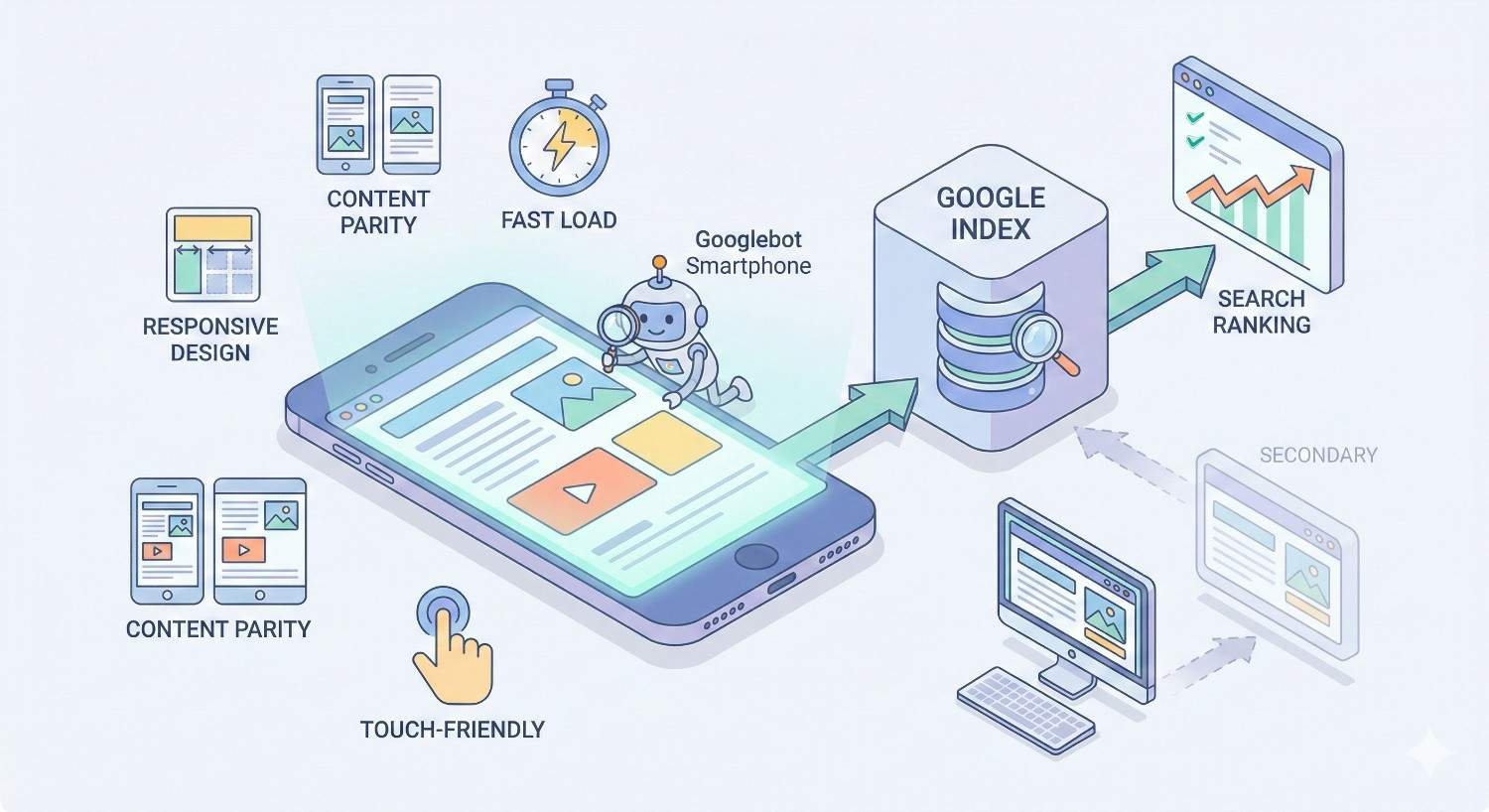
Google primarily uses mobile Googlebot for crawling and indexing. This means your mobile site determines how Google understands and ranks your content across all devices.
If content exists only on your desktop version, Google may not index it. Resources blocked on mobile but accessible on desktop can cause indexing issues. Ensuring crawl accessibility on mobile is essential for overall SEO performance.
Crawl budget considerations also differ. Mobile pages should load efficiently to maximize crawl efficiency. Heavy pages that load slowly on mobile may receive less frequent crawling.
Google’s Mobile-First Indexing Explained
Mobile-first indexing represents one of the most significant changes in Google’s history. Understanding how it works helps you prioritize optimization efforts and avoid common pitfalls that hurt rankings.
What Mobile-First Indexing Means for Your Website
Mobile-first indexing means Google predominantly uses the mobile version of your content for indexing and ranking. Your mobile site is now your primary site in Google’s eyes.
This shift happened because most searches now occur on mobile devices. Google wants to ensure its index reflects what the majority of users actually see when they visit websites.
For your website, this means mobile optimization directly impacts desktop rankings. A poorly optimized mobile site can hurt your visibility across all devices, not just smartphones.
How to Check Your Mobile-First Indexing Status
Google Search Console provides information about your mobile-first indexing status. Check the settings section to confirm whether Google is using mobile-first indexing for your site.
You can also use the URL Inspection tool to see how Googlebot views your pages. Compare the mobile and desktop rendered versions to identify any discrepancies that could affect indexing.
Most websites have been migrated to mobile-first indexing. New sites are automatically indexed mobile-first. If you have not confirmed your status, checking Search Console should be an immediate priority.
Common Mobile-First Indexing Issues
Content parity problems are the most frequent mobile-first indexing issue. If your mobile site shows less content than desktop, Google only indexes what appears on mobile. This can significantly reduce your ranking potential.
Structured data inconsistencies cause problems when markup exists on desktop but not mobile. Google uses mobile structured data for rich results. Missing mobile markup means missing rich snippet opportunities.
Image and video issues occur when media is blocked or formatted differently on mobile. Ensure all important visual content is accessible and properly optimized for mobile crawling.
Mobile SEO Ranking Factors
Mobile-specific ranking factors determine how well your site performs in mobile search results. These factors focus on speed, usability, and the overall mobile experience you provide to users.
Core Web Vitals for Mobile
Core Web Vitals measure real-world user experience on your pages. The three metrics are Largest Contentful Paint (LCP), Interaction to Next Paint (INP), and Cumulative Layout Shift (CLS).
LCP measures loading performance. For mobile, achieving an LCP under 2.5 seconds requires optimizing images, reducing server response times, and minimizing render-blocking resources.
INP measures interactivity and responsiveness. Mobile users expect immediate feedback when tapping buttons or links. Optimizing JavaScript execution and reducing main thread blocking improves INP scores.
CLS measures visual stability. Mobile layouts must remain stable as content loads. Reserving space for images and ads prevents frustrating layout shifts that hurt user experience and rankings.
Mobile Page Speed Optimization
Mobile page speed optimization requires specific techniques beyond general performance improvements. Image optimization is critical since images often account for the majority of page weight on mobile.
Implementing lazy loading defers off-screen content until users scroll. This dramatically improves initial load times without sacrificing content depth. Modern browsers support native lazy loading, making implementation straightforward.
Minimizing JavaScript is essential for mobile performance. Heavy scripts block rendering and drain battery life. Audit your JavaScript usage and remove unnecessary code to improve mobile speed.
Mobile Usability and UX Signals
Mobile usability encompasses how easily users can navigate and interact with your site on small screens. Google evaluates tap target sizing, font readability, and viewport configuration as usability signals.
Tap targets should be at least 48 pixels in height and width with adequate spacing between interactive elements. Users should not need to zoom or struggle to tap the correct link or button.
Font sizes must be readable without zooming. A base font size of 16 pixels or larger ensures comfortable reading on mobile devices. Line height and contrast also affect readability and usability.
Responsive Design vs Dynamic Serving vs Separate URLs
Three main approaches exist for serving mobile content. Responsive design uses the same URL and HTML with CSS adapting the layout. Dynamic serving uses the same URL but serves different HTML based on device. Separate URLs maintain distinct mobile and desktop versions.
Google recommends responsive design for most websites. It simplifies maintenance, consolidates link equity, and ensures content parity. One URL means one set of signals for Google to evaluate.
Dynamic serving works well for sites needing significantly different mobile experiences. Proper Vary HTTP headers are essential to help Google understand the different versions.
Separate mobile URLs (m.example.com) are increasingly rare and harder to maintain. They require proper canonical and alternate tags to avoid duplicate content issues. Most sites should migrate to responsive design.
Desktop SEO Ranking Factors
Desktop SEO factors remain important despite mobile-first indexing. Many users still conduct significant research and transactions on desktop devices. Optimizing for desktop ensures you capture this valuable traffic.
Desktop Page Experience Signals
Desktop page experience includes Core Web Vitals measured on desktop devices. Thresholds are the same, but desktop typically achieves better scores due to faster connections and more powerful hardware.
Desktop-specific experience factors include hover states, keyboard navigation, and multi-column layouts. These elements should enhance usability without creating accessibility barriers.
Security signals like HTTPS apply equally to desktop and mobile. Safe browsing status and absence of intrusive interstitials also factor into desktop page experience evaluation.
Content Depth and Engagement Metrics
Desktop users often engage with longer, more detailed content. They have larger screens and typically more time for in-depth reading. This creates opportunities for comprehensive content that thoroughly covers topics.
Engagement metrics like time on page and scroll depth tend to be higher on desktop for informational content. Creating content that matches desktop user expectations can improve these signals.
However, content depth should not mean unnecessary padding. Every section should provide value. Desktop users appreciate comprehensive coverage, not verbose writing that wastes their time.
Desktop-Specific Technical Considerations
Desktop technical SEO includes optimizing for larger viewport sizes and ensuring complex layouts render correctly. Multi-column designs, sidebars, and advanced navigation require proper implementation.
Browser compatibility matters more on desktop due to the variety of browsers and versions in use. Testing across Chrome, Firefox, Safari, and Edge ensures consistent experiences.
Desktop pages can leverage larger images and more complex interactive elements. However, these should enhance user experience rather than slow down performance or create accessibility issues.
How to Optimize for Both Mobile and Desktop
A unified optimization approach ensures consistent performance across all devices. The goal is creating experiences that adapt to each platform while maintaining content quality and technical excellence.
Responsive Web Design Best Practices
Responsive design should be your default approach. Use fluid grids, flexible images, and CSS media queries to create layouts that adapt to any screen size.
Start with mobile-first CSS. Define base styles for mobile, then use media queries to enhance layouts for larger screens. This approach ensures mobile performance is prioritized.
Test responsive breakpoints thoroughly. Common breakpoints include 320px, 768px, 1024px, and 1440px. Your design should look good and function well at every size, not just at specific breakpoints.
Content Parity Between Mobile and Desktop
Content parity means your mobile and desktop versions contain the same essential content. Google indexes mobile content, so anything missing from mobile will not be indexed.
This does not mean identical presentation. Mobile content can be reorganized, collapsed into accordions, or reformatted for smaller screens. The information itself must remain accessible.
Audit your site for content parity issues. Compare mobile and desktop versions of key pages. Ensure headings, body content, images, and structured data match across both versions.
Structured Data Implementation
Structured data must be present on mobile pages for Google to use it. If you implement schema markup only on desktop, you lose rich result opportunities.
Use the same structured data on both versions. For responsive sites, this happens automatically. For dynamic serving or separate URLs, ensure mobile pages include complete markup.
Test structured data using Google’s Rich Results Test with mobile user agent selected. This confirms Google can access and parse your markup from the mobile version.
Cross-Device Testing and Monitoring
Regular testing across devices catches issues before they impact rankings. Use browser developer tools to simulate various screen sizes and connection speeds.
Google Search Console provides mobile usability reports highlighting issues Google detected during crawling. Address these issues promptly to maintain mobile search visibility.
Real user monitoring tools show actual performance data from visitors on different devices. This data reveals issues that lab testing might miss and helps prioritize optimization efforts.
Mobile vs Desktop Traffic: What the Data Shows
Understanding traffic patterns helps you allocate SEO resources effectively. Data reveals where your audience actually comes from and how behavior differs across devices.
Global Mobile vs Desktop Usage Statistics
Mobile devices account for approximately 60% of global web traffic according to Statcounter data. This percentage continues to grow, though the rate of increase has slowed as mobile adoption matures.
However, global averages mask significant variations. Developed markets show more balanced mobile-desktop splits. Emerging markets skew heavily toward mobile due to smartphone-first internet adoption.
Traffic share does not equal conversion share. Desktop users often convert at higher rates for complex purchases. Understanding both traffic and conversion patterns informs strategy.
Industry-Specific Traffic Patterns
Traffic patterns vary dramatically by industry. Local services, restaurants, and entertainment see mobile traffic shares exceeding 70%. B2B software and financial services often maintain desktop majorities.
E-commerce shows mixed patterns. Product research frequently happens on mobile, while purchases often complete on desktop. This creates cross-device journeys that complicate attribution.
Your industry benchmarks provide context, but your own data matters most. Industry averages are starting points, not targets. Your specific audience may differ significantly from averages.

How to Analyze Your Own Mobile vs Desktop Traffic
Google Analytics provides device category breakdowns for all traffic metrics. Compare sessions, bounce rates, conversion rates, and revenue across mobile, desktop, and tablet.
Segment by traffic source to understand channel-specific patterns. Organic search traffic may have different device distributions than social or direct traffic.
Track trends over time rather than focusing on single snapshots. Seasonal patterns, marketing campaigns, and site changes all affect device distributions. Long-term trends reveal where to focus optimization efforts.
Common Mobile SEO Mistakes to Avoid
Mobile SEO mistakes can devastate your search visibility. These errors often go unnoticed until rankings drop significantly. Proactive identification and correction prevents costly problems.
Blocked Resources and Faulty Redirects
Blocking CSS, JavaScript, or images in robots.txt prevents Google from rendering your mobile pages correctly. Google needs access to all resources to understand your page layout and content.
Faulty redirects frustrate users and confuse search engines. Every desktop URL should redirect to the equivalent mobile URL, not the mobile homepage. Redirect chains should be minimized.
Test your robots.txt configuration using Google Search Console. Ensure Googlebot can access all resources needed to render your pages. Fix any blocked resources immediately.
Intrusive Interstitials and Pop-ups
Google penalizes pages with intrusive interstitials that block content on mobile. Full-screen pop-ups, difficult-to-dismiss overlays, and above-the-fold interstitials trigger this penalty.
Acceptable interstitials include legally required notices (cookie consent, age verification), login dialogs for private content, and reasonably sized banners that do not block significant content.
If you use pop-ups for lead generation, ensure they do not cover the main content immediately on page load. Delay triggers, use smaller formats, or implement exit-intent triggers instead.
Unplayable Content and Touch Element Errors
Content requiring Flash or other unsupported technologies will not play on mobile devices. Ensure all video and interactive content uses HTML5 and modern web standards.
Touch element errors occur when clickable elements are too small or too close together. Users accidentally tap wrong links, creating frustration and negative engagement signals.
Audit your mobile pages for touch target issues. Google Search Console reports these errors. Fix them by increasing element sizes and adding spacing between interactive elements.
Tools for Mobile and Desktop SEO Analysis
The right tools help you identify issues, track progress, and make data-driven optimization decisions. These tools provide insights into how search engines and users experience your site.
Google Search Console Mobile Usability Report
The Mobile Usability report in Search Console identifies pages with mobile-specific issues. Common reported problems include text too small, clickable elements too close, and content wider than screen.
This report shows affected pages and issue types. Prioritize fixing issues affecting the most pages or most important pages first. Revalidate fixes to confirm Google recognizes the improvements.
The report updates as Google recrawls your pages. Major fixes may take weeks to reflect in the report. Monitor trends rather than expecting immediate changes.
PageSpeed Insights and Lighthouse
PageSpeed Insights analyzes both mobile and desktop performance using real user data and lab tests. The tool provides specific recommendations for improving Core Web Vitals and overall speed.
Lighthouse, available in Chrome DevTools, offers detailed performance audits. It identifies specific opportunities like image optimization, JavaScript reduction, and caching improvements.
Run both tools regularly on key pages. Performance can degrade over time as new features and content are added. Continuous monitoring catches regressions before they impact rankings.
Mobile-Friendly Testing Tools
Google’s Mobile-Friendly Test confirms whether pages meet basic mobile usability standards. It shows how Googlebot renders your page and identifies any loading issues.
Browser developer tools simulate various mobile devices. Chrome DevTools device mode lets you test specific screen sizes, pixel ratios, and network conditions.
Real device testing remains valuable despite simulation tools. Actual smartphones reveal issues simulators miss, including touch responsiveness and real-world performance.
Building a Unified SEO Strategy for All Devices
A unified strategy ensures consistent optimization without duplicating effort. The goal is building a foundation that performs well everywhere while addressing device-specific needs efficiently.
Prioritizing Mobile Without Neglecting Desktop
Start with mobile optimization since Google uses mobile-first indexing. Ensure your mobile site is fast, usable, and contains all important content. This foundation benefits all devices.
Layer desktop enhancements on top of mobile optimization. Use progressive enhancement to add features for larger screens without compromising mobile performance.
Allocate resources based on your traffic data. If desktop drives significant revenue, ensure desktop experience receives appropriate attention. Mobile-first does not mean mobile-only.
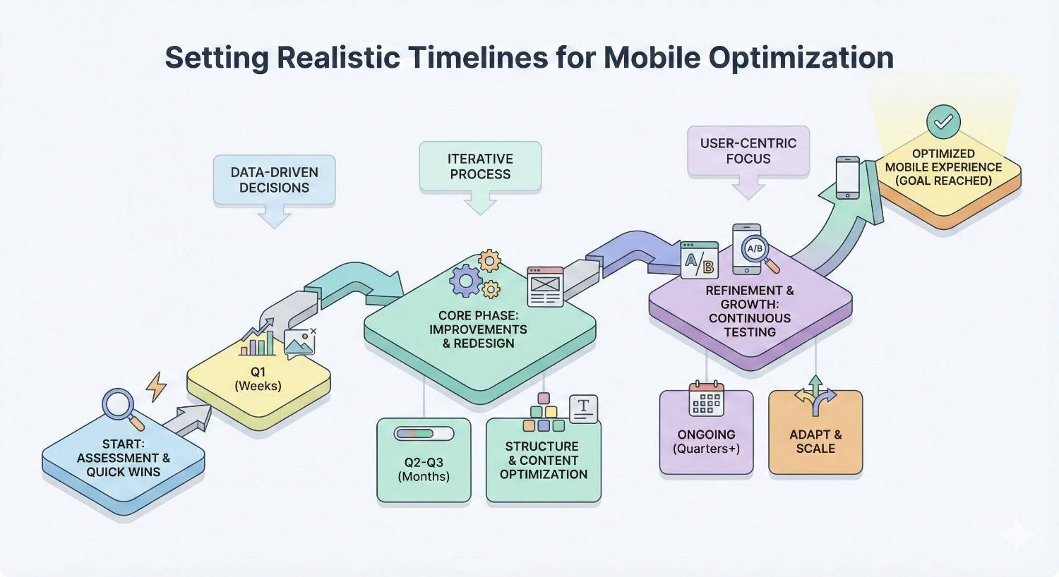
Setting Realistic Timelines for Mobile Optimization
Mobile optimization is not a one-time project. Initial improvements may take three to six months to fully implement depending on site size and technical debt.
Prioritize high-impact fixes first. Core Web Vitals improvements, mobile usability errors, and content parity issues should be addressed before minor optimizations.
Expect ranking improvements to follow optimization by weeks or months. Google needs to recrawl and reprocess your pages. Patience and consistent effort produce results.
Measuring ROI Across Devices
Track conversions and revenue by device category to understand true ROI. Mobile traffic growth means little if it does not contribute to business goals.
Attribution modeling helps understand cross-device journeys. Users who research on mobile and convert on desktop still represent mobile SEO value. Single-device attribution undervalues mobile.
Set device-specific KPIs based on realistic expectations. Mobile conversion rates are typically lower than desktop for complex purchases. Evaluate each device against appropriate benchmarks.
Conclusion
Mobile and desktop SEO require distinct approaches within a unified strategy. Google’s mobile-first indexing makes mobile optimization essential, but desktop performance still matters for significant portions of your audience. Understanding the differences in user behavior, technical requirements, and ranking factors helps you allocate resources effectively.
Building sustainable organic growth across all devices requires ongoing attention to Core Web Vitals, content parity, and user experience. The data shows mobile dominates traffic globally, but your specific audience patterns should guide prioritization. Regular testing and monitoring catch issues before they impact rankings.
We help businesses build comprehensive SEO strategies that perform across all devices. White Label SEO Service provides the technical expertise, content strategy, and ongoing optimization needed to capture traffic and conversions from every screen. Contact us to discuss how we can improve your mobile and desktop search visibility.
Frequently Asked Questions
Is mobile SEO more important than desktop SEO?
Mobile SEO is more important for indexing since Google uses mobile-first indexing. However, both matter for capturing your full audience. Prioritize mobile optimization first, then ensure desktop experience meets user expectations.
Does Google rank mobile and desktop separately?
Google maintains separate search results for mobile and desktop queries, but uses the same index based on your mobile site. Rankings can differ between devices based on mobile usability signals and user intent matching.
How long does mobile SEO take to show results?
Initial mobile SEO improvements typically show results within three to six months. Technical fixes like speed improvements may impact rankings faster. Comprehensive mobile optimization is an ongoing process rather than a one-time project.
What is the difference between mobile-friendly and mobile-optimized?
Mobile-friendly means a site works on mobile devices without major usability issues. Mobile-optimized means the site is specifically designed for excellent mobile performance, including fast load times, intuitive navigation, and content formatted for small screens.
Should small businesses focus on mobile or desktop first?
Small businesses should focus on mobile first due to mobile-first indexing and local search patterns. Most local searches happen on mobile devices. Ensure your mobile site is fast and usable before investing heavily in desktop-specific features.
Can I have different content on mobile and desktop versions?
You can format content differently, but the core information should be the same. Google indexes mobile content, so anything missing from mobile will not be indexed. Use responsive design to maintain content parity automatically.
How do I know if my site has mobile SEO problems?
Check Google Search Console for mobile usability errors and Core Web Vitals issues. Run PageSpeed Insights tests on key pages. Review your mobile traffic and conversion data in Google Analytics for signs of user experience problems.


