
Cumulative Layout Shift destroys user experience and tanks your Core Web Vitals scores. When page elements jump unexpectedly, visitors lose trust, abandon forms mid-completion, and click wrong buttons. Google measures this instability and factors it directly into rankings.
This guide delivers everything you need to diagnose, fix, and prevent CLS issues. You’ll learn measurement techniques, common causes, platform-specific solutions, and advanced strategies that work.
Whether you’re troubleshooting a failing PageSpeed score or building CLS-proof pages from scratch, these optimization techniques will stabilize your layouts and improve search performance.
What Is Cumulative Layout Shift (CLS)?
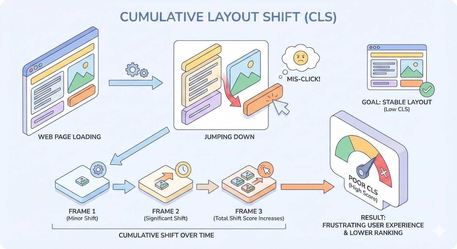
Cumulative Layout Shift measures visual stability during page load. It quantifies how much visible content moves unexpectedly while users interact with your page. Unlike other performance metrics focused on speed, CLS captures the frustrating experience of content jumping around.
Google introduced CLS as part of Core Web Vitals in 2020. The metric specifically targets unexpected layout shifts that occur without user input. When you click a link and the page suddenly moves, causing you to click something else entirely, that’s exactly what CLS measures.
Layout shifts happen when elements change position after initially rendering. Images loading without reserved space, ads injecting into content, or fonts swapping all trigger these shifts. Each shift gets scored based on how much content moved and how far it traveled.
How CLS Is Measured and Calculated
CLS uses a specific formula: impact fraction × distance fraction. The impact fraction represents the viewport area affected by the shift. The distance fraction measures how far elements moved relative to the viewport.
Consider an element covering 50% of the viewport that shifts down by 25% of the viewport height. The impact fraction is 0.5, the distance fraction is 0.25, and the layout shift score equals 0.125.
Google’s measurement approach changed significantly in 2021. Previously, CLS accumulated all shifts throughout the entire page session. Now, it uses a “session window” approach. The metric captures the maximum burst of layout shifts within a 5-second window, with a 1-second gap between shifts. This change better reflects actual user experience on long-lived pages.
The final CLS score represents the largest session window value. Pages with multiple small shifts spread over time score better than pages with concentrated bursts of movement.
What Causes Layout Shifts on Web Pages
Layout shifts stem from content that renders before the browser knows its final dimensions. The browser initially places elements based on available information, then repositions everything when actual sizes become known.
Images without width and height attributes cause the most common shifts. The browser reserves zero space initially, then pushes content down when images load. Videos and iframes create identical problems.
Web fonts trigger shifts through two mechanisms. Flash of Invisible Text (FOIT) shows blank space until fonts load. Flash of Unstyled Text (FOUT) displays fallback fonts first, then swaps to custom fonts with different dimensions.
Dynamically injected content creates severe shifts. Ad networks inserting banners, cookie consent bars appearing, and JavaScript adding elements above existing content all push visible content around.
Late-loading CSS can reflow entire pages. When stylesheets load after initial render, elements may completely change size and position based on new rules.
Good vs. Poor CLS Scores: Google’s Thresholds
Google defines three CLS performance tiers. Scores of 0.1 or less indicate good performance. Scores between 0.1 and 0.25 need improvement. Scores above 0.25 indicate poor performance requiring immediate attention.
These thresholds apply to the 75th percentile of page loads. Your CLS score represents the experience of 75% of your visitors. Even if most users see stable pages, a significant minority experiencing shifts will hurt your score.
The 0.1 threshold seems strict, but it’s achievable. A shift affecting 20% of the viewport moving 50% of viewport height equals exactly 0.1. Most well-optimized pages achieve scores under 0.05.
Field data from real users determines your official Core Web Vitals status. Lab tests provide diagnostic information, but Google uses Chrome User Experience Report (CrUX) data for ranking signals.
Why CLS Optimization Matters for SEO and User Experience
CLS optimization directly impacts both search rankings and business outcomes. Poor visual stability frustrates users and signals quality issues to search engines. The connection between stable layouts and positive user signals creates compounding benefits.
Users who experience layout shifts exhibit measurable behavior changes. They spend less time on pages, engage with fewer elements, and convert at lower rates. These behavioral signals reinforce the direct ranking impact of CLS scores.
Fixing CLS issues often reveals broader technical debt. Sites with layout shift problems typically have other performance issues. Addressing CLS frequently improves overall site quality.
CLS as a Core Web Vitals Ranking Signal
Google confirmed Core Web Vitals as ranking factors in 2021. CLS joins Largest Contentful Paint (LCP) and Interaction to Next Paint (INP) as the three metrics determining page experience scores.
The ranking impact operates as a tiebreaker rather than a dominant factor. When content quality and relevance are similar between competing pages, Core Web Vitals can determine which ranks higher. Sites with poor CLS won’t outrank superior content, but they may lose positions to equivalent competitors.
Google’s page experience update applies to all search results globally. Both mobile and desktop rankings consider Core Web Vitals, though mobile-first indexing means mobile performance often matters more.
The “Good” threshold matters for ranking benefits. Pages scoring “Needs Improvement” or “Poor” don’t receive the same treatment as pages meeting all Core Web Vitals thresholds.
Impact of Layout Shifts on Conversion Rates and Engagement
Layout shifts directly cause conversion losses. Users clicking buttons that move end up on wrong pages. Form submissions fail when submit buttons shift. Product additions to cart miss their targets.
Research from Google demonstrates that reducing CLS correlates with improved engagement metrics. Pages with better visual stability see lower bounce rates, longer session durations, and higher pages per session.
E-commerce sites experience measurable revenue impact. When add-to-cart buttons shift, users either miss clicks or accidentally add wrong items. Both outcomes reduce completed purchases.
Content sites lose ad revenue when shifts cause accidental ad clicks. Users who click ads unintentionally immediately bounce, generating low-quality traffic that advertisers eventually stop paying for.
Mobile vs. Desktop CLS Performance Differences
Mobile devices typically experience worse CLS than desktop. Smaller viewports mean shifts represent larger percentages of visible area. The same absolute pixel movement creates higher CLS scores on mobile.
Network variability on mobile increases shift likelihood. Slower connections mean longer gaps between initial render and resource loading. More time for users to start interacting before layouts stabilize.
Touch interfaces amplify shift consequences. Desktop users can reposition cursors quickly. Mobile users committed to tap locations can’t adjust mid-gesture when content moves.
Responsive design introduces mobile-specific shift sources. Elements that fit on desktop may wrap or resize on mobile, creating shifts that don’t exist in desktop testing.
Google’s mobile-first indexing prioritizes mobile CLS scores. Your mobile performance determines how Google evaluates your pages, regardless of desktop scores.
How to Measure and Diagnose CLS Issues
Effective CLS optimization requires accurate measurement. Multiple tools provide different perspectives on layout shift problems. Combining lab testing with field data gives complete visibility into user experience.
Diagnosis goes beyond knowing your score. Identifying which specific elements cause shifts enables targeted fixes. Generic optimization attempts waste effort when precise culprits remain unknown.
Measurement should happen before and after changes. Baseline scores establish improvement targets. Post-fix measurements confirm solutions worked without introducing new problems.
Using Google PageSpeed Insights to Check CLS
PageSpeed Insights provides the most accessible CLS measurement. Enter any URL to receive both lab and field data. The tool clearly displays CLS scores with pass/fail indicators.
Field data comes from CrUX when available. This represents actual user experience over the previous 28 days. Not all pages have sufficient traffic for field data inclusion.
Lab data comes from Lighthouse running in a simulated environment. These scores indicate potential issues but may not match real-world performance. Lab tests use specific device and network configurations that differ from actual user conditions.
The “Diagnostics” section identifies specific elements causing shifts. PageSpeed Insights highlights problematic images, fonts, and injected content. These diagnostics guide optimization priorities.
Origin-level data shows overall site performance. Individual page scores matter, but origin summaries reveal systemic issues affecting multiple pages.
Measuring CLS with Chrome DevTools and Lighthouse
Chrome DevTools provides real-time CLS measurement during development. The Performance panel records layout shifts as they occur. You can see exactly when shifts happen and which elements moved.
Enable “Layout Shift Regions” in DevTools rendering settings. This visually highlights shifted areas with blue overlays. Watching pages load with this enabled reveals shift sources immediately.
The Performance panel’s “Experience” track shows individual layout shift events. Click any shift to see affected elements and their movement distances. This granular data pinpoints exact causes.
Lighthouse audits include CLS measurement and specific recommendations. Run Lighthouse from DevTools, Chrome extensions, or command line. The audit identifies elements contributing to CLS with actionable fix suggestions.
DevTools throttling simulates slower connections. Testing with network throttling reveals shifts that only appear under realistic mobile conditions.
Monitoring CLS in Google Search Console
Search Console’s Core Web Vitals report shows CLS status across your entire site. Pages are grouped by similar structure, making it easy to identify template-level issues.
The report categorizes URLs as Good, Needs Improvement, or Poor. Clicking any category reveals affected URL patterns. This grouping helps prioritize fixes by impact.
Search Console uses field data exclusively. Scores reflect actual user experience, not lab simulations. This data determines your ranking eligibility for page experience benefits.
The report updates as Google collects new CrUX data. After implementing fixes, monitor Search Console for score improvements. Changes typically appear within 28 days as new data replaces old.
Validation requests tell Google to recheck fixed pages. After addressing issues, use the validation feature to accelerate reassessment.
Real User Monitoring (RUM) vs. Lab Data for CLS
Lab data comes from controlled test environments. Tools like Lighthouse run standardized tests with specific device profiles and network conditions. Results are reproducible but may not reflect real user experience.
Field data (RUM) captures actual user sessions. CrUX aggregates anonymized Chrome user data. Third-party RUM tools provide more detailed breakdowns of real performance.
Lab and field scores often differ significantly. Lab tests typically show better CLS because they use fast connections and don’t capture all user interactions. Field data includes slow networks, varied devices, and extended sessions.
Google uses field data for ranking decisions. Lab data helps diagnose issues, but CrUX scores determine Core Web Vitals status. Optimizing for lab scores alone may not improve rankings.
RUM tools like web-vitals JavaScript library enable custom field data collection. Implementing RUM provides visibility into performance across your actual user base.
Identifying Which Elements Cause Layout Shifts
The Layout Instability API exposes shift details programmatically. JavaScript can capture which elements shifted and by how much. This data enables automated monitoring and alerting.
Chrome DevTools’ Performance panel shows shift sources visually. Record a page load, then examine the Experience track. Each shift event lists affected nodes.
Web Vitals extension for Chrome displays real-time CLS with element attribution. The extension shows which elements contributed to the current page’s score.
Common culprits follow predictable patterns. Images without dimensions, ad containers, font-loading elements, and dynamically injected content cause most shifts. Check these categories first.
Testing with slow network throttling reveals timing-dependent shifts. Elements that load quickly on fast connections may cause shifts on slower networks.
Common Causes of Poor CLS Scores
Understanding shift causes enables systematic prevention. Most CLS issues stem from a small number of common patterns. Addressing these patterns eliminates the majority of layout instability.
Each cause has specific solutions. Generic performance optimization may not address CLS directly. Targeted fixes for known causes produce faster results.
Prevention costs less than remediation. Building CLS awareness into development processes stops shifts before they reach production.
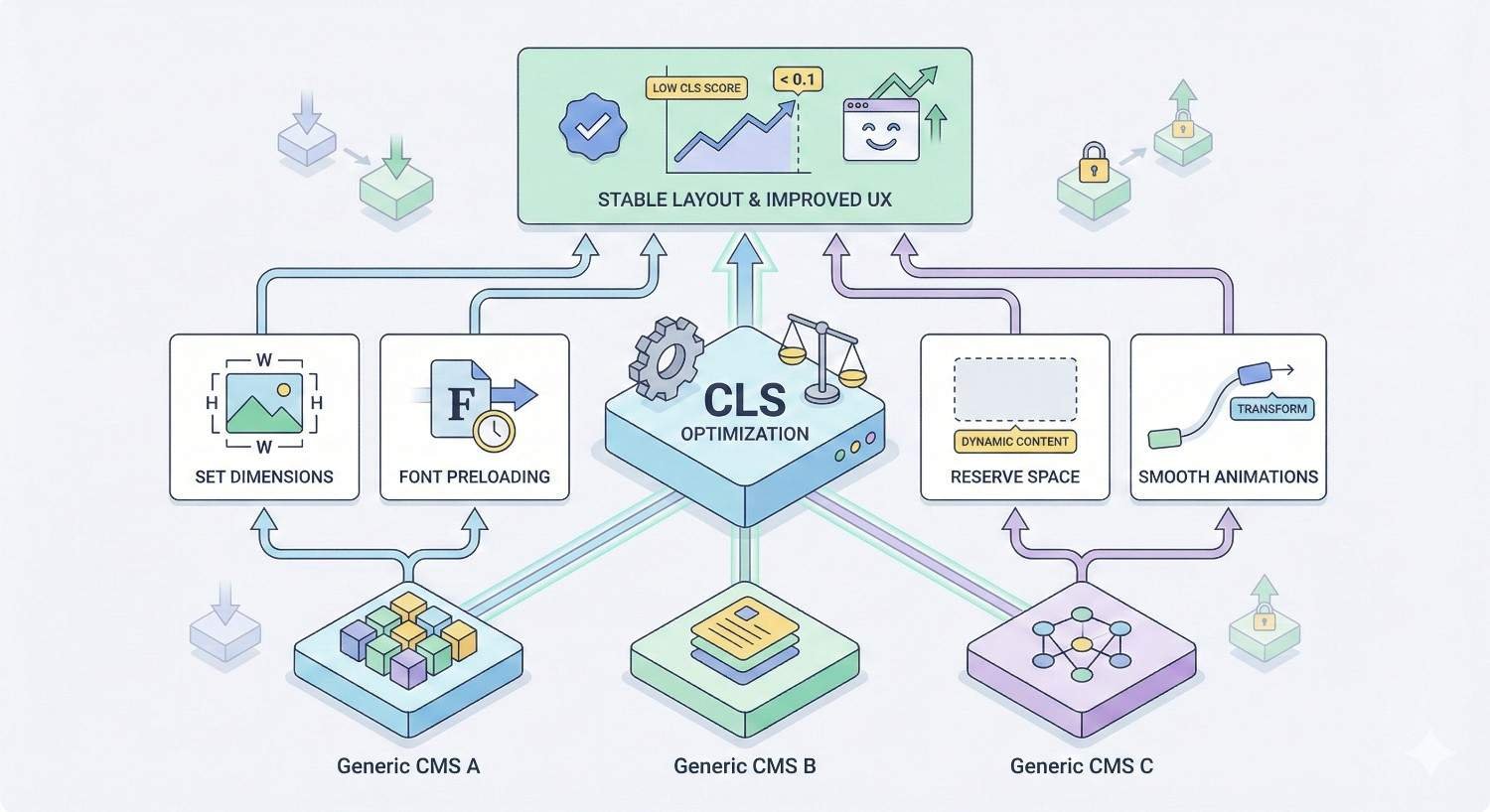
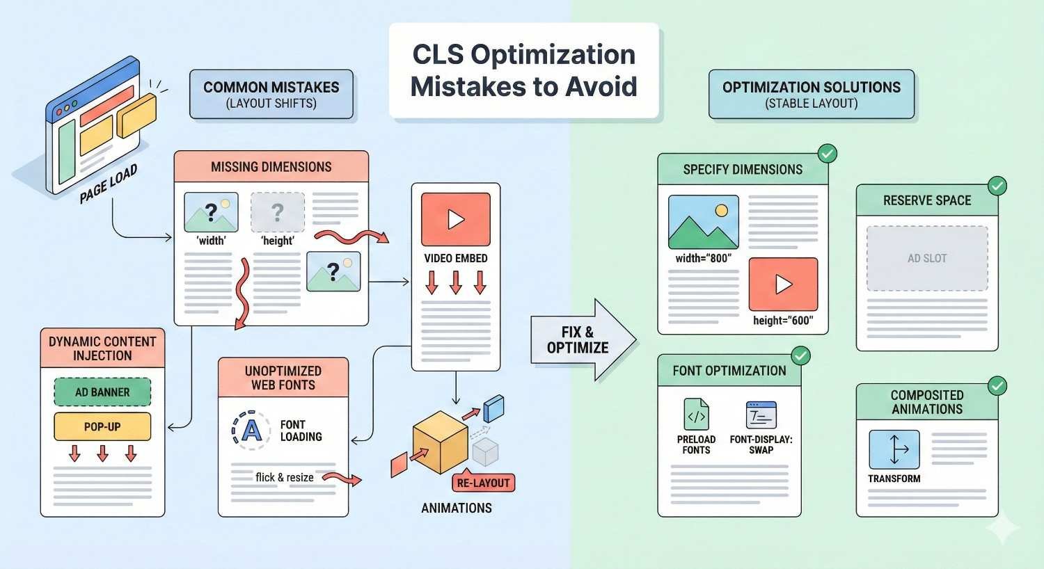
Images Without Dimensions (Width and Height Attributes)
Images without explicit dimensions cause the most widespread CLS issues. Browsers can’t reserve space for images until they download enough data to determine size. Content below images shifts when dimensions become known.
The fix is straightforward: add width and height attributes to all image tags. These attributes tell browsers the aspect ratio before images load. Browsers reserve appropriate space immediately.
html
Copy
<img src=”photo.jpg“ width=”800“ height=”600“ alt=”Description“>
Modern browsers use width and height to calculate aspect ratios even with CSS sizing. The attributes don’t force pixel dimensions when CSS specifies percentages or other units.
Responsive images need both attributes and CSS. Set width and height to actual image dimensions, then use CSS to control display size. Browsers maintain aspect ratio while scaling.
Content management systems often strip dimension attributes. Check your CMS output and configure it to preserve or add dimensions automatically.
Ads, Embeds, and Iframes Without Reserved Space
Advertising networks inject content with unpredictable dimensions. Ad slots may fill with different creative sizes. Without reserved space, surrounding content shifts when ads load.
Embeds from YouTube, Twitter, and other platforms behave similarly. The embed container starts empty, then expands when third-party content loads.
Reserve minimum space for ad containers using CSS. Set min-height based on the smallest expected ad size. Content shifts less when ads load into pre-sized containers.
css
Copy
.ad-container {
min-height: 250px;
}
Iframes need explicit dimensions or aspect ratio containers. Wrapping iframes in containers with padding-based aspect ratios prevents shifts.
Consider lazy-loading ads below the fold. Ads that load after users scroll past them don’t contribute to CLS because they’re outside the viewport during the shift.
Web Fonts Causing FOIT and FOUT
Custom web fonts load after initial page render. Browsers handle missing fonts differently, but both approaches cause layout shifts.
FOIT (Flash of Invisible Text) shows blank space where text should appear. When fonts load, text suddenly appears, potentially shifting surrounding content.
FOUT (Flash of Unstyled Text) displays fallback fonts first. When custom fonts load, text reflows with different character widths, shifting content.
The font-display CSS property controls this behavior. Using font-display: swap shows fallback fonts immediately, reducing perceived load time but potentially causing shifts.
css
Copy
@font-face {
font-family: ‘CustomFont’;
src: url(‘font.woff2’) format(‘woff2’);
font-display: swap;
}
Preloading critical fonts reduces swap timing. Fonts that load before render don’t cause visible shifts.
html
Copy
<link rel=”preload“ href=”font.woff2“ as=”font“ type=”font/woff2“ crossorigin>
Matching fallback font metrics to custom fonts minimizes reflow. Tools like Font Style Matcher help configure fallbacks with similar dimensions.
Dynamically Injected Content Above Existing Content
JavaScript that inserts content above visible elements causes severe shifts. Cookie banners, notification bars, and promotional messages often inject at page top, pushing everything down.
The solution: reserve space for dynamic content or inject below existing content. If a banner will appear, include its container in initial HTML with appropriate height.
Alternatively, use overlays instead of injected content. Elements positioned with position: fixed or position: absolute don’t affect document flow. They appear over content rather than pushing it.
Lazy-loaded content should only inject in the direction users scroll. Adding content below the viewport doesn’t cause CLS. Adding content above visible areas does.
Infinite scroll implementations need careful handling. New content should append below existing content, never insert above.
CSS Animations and Transitions Triggering Shifts
Not all CSS animations cause layout shifts. Only animations affecting layout properties trigger CLS. Properties like width, height, margin, and padding change element dimensions and positions.
Transform and opacity animations don’t cause layout shifts. These properties are “compositor-only” and don’t trigger reflow. Moving elements with transform: translate() instead of changing top/left positions avoids CLS.
css
Copy
/* Causes layout shift */
.element {
animation: shift 1s;
}
@keyframes shift {
from { margin-left: 0; }
to { margin-left: 100px; }
}
/* No layout shift */
.element {
animation: slide 1s;
}
@keyframes slide {
from { transform: translateX(0); }
to { transform: translateX(100px); }
}
Transitions on layout properties also cause shifts. Hover effects that change padding or dimensions trigger CLS when users interact.
Audit existing animations for layout-triggering properties. Replace with transform-based alternatives where possible.
Late-Loading JavaScript Affecting Page Layout
JavaScript that modifies DOM after initial render causes shifts. Scripts that add elements, change styles, or resize containers all potentially trigger CLS.
Defer non-critical JavaScript to reduce initial load interference. Scripts that don’t affect above-the-fold content can load after initial render completes.
Critical JavaScript should execute before first paint when possible. Inline essential scripts or use appropriate loading strategies to ensure layout-affecting code runs early.
Third-party scripts are particularly problematic. Analytics, chat widgets, and social sharing buttons often inject content unpredictably. Audit third-party scripts for CLS impact.
Use the async and defer attributes appropriately. Async scripts execute immediately when downloaded, potentially during render. Defer scripts wait until HTML parsing completes.
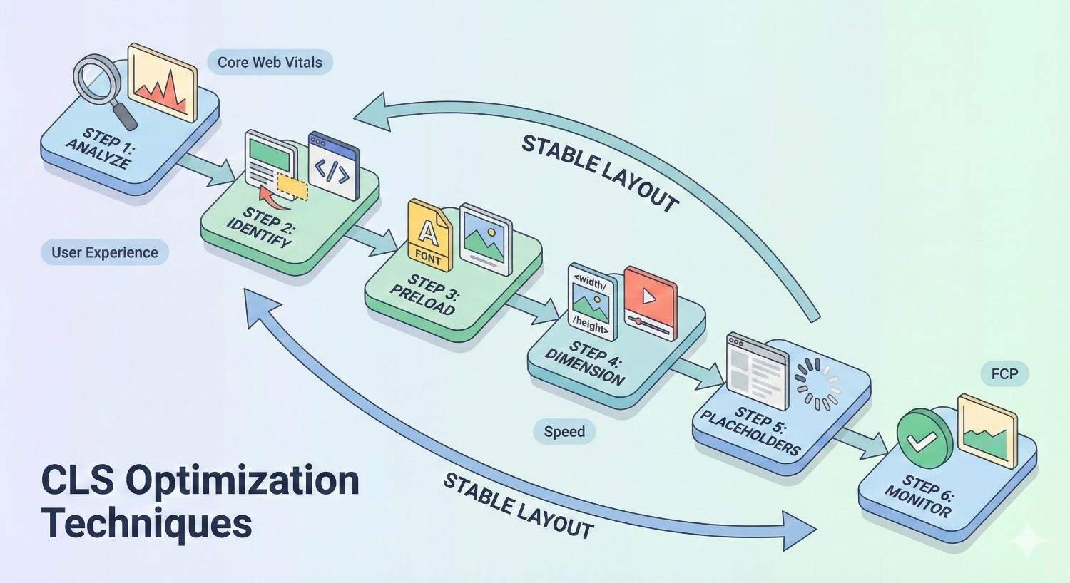
Step-by-Step CLS Optimization Techniques
Systematic optimization addresses CLS causes methodically. Following proven techniques ensures comprehensive coverage. Each step builds on previous improvements.
Prioritize fixes by impact. Address the largest shift sources first. Measurement data guides prioritization decisions.
Document changes for future reference. CLS issues often recur when new features launch. Maintaining optimization knowledge prevents regression.
Set Explicit Width and Height Attributes on Images and Videos
Add width and height attributes to every image and video element. Use the actual intrinsic dimensions of the media file.
html
Copy
<img src=”hero.jpg“ width=”1200“ height=”630“ alt=”Hero image“>
<video width=”1920“ height=”1080“ controls>
<source src=”video.mp4“ type=”video/mp4“>
</video>
For responsive images, the attributes establish aspect ratio. CSS controls actual display size while browsers maintain proportions.
css
Copy
img {
max-width: 100%;
height: auto;
}
Audit existing content for missing dimensions. Automated tools can scan HTML for images lacking width/height attributes.
Update content management workflows to require dimensions. Prevent future uploads without proper attributes.
Use CSS Aspect Ratio Boxes for Responsive Media
The CSS aspect-ratio property provides native aspect ratio support. Modern browsers reserve space based on specified ratios without JavaScript.
css
Copy
.video-container {
aspect-ratio: 16 / 9;
width: 100%;
}
.square-image {
aspect-ratio: 1 / 1;
}
For older browser support, use the padding-bottom technique. A container with percentage-based padding creates aspect ratio boxes.
css
Copy
.aspect-ratio-box {
position: relative;
width: 100%;
padding-bottom: 56.25%; /* 16:9 ratio */
}
.aspect-ratio-box > * {
position: absolute;
top: 0;
left: 0;
width: 100%;
height: 100%;
}
Apply aspect ratio containers to all embedded content. YouTube videos, maps, and third-party widgets benefit from pre-sized containers.
Reserve Space for Ads and Third-Party Embeds
Determine minimum dimensions for ad placements. Work with ad networks to understand possible creative sizes. Reserve space for the smallest common size.
css
Copy
.ad-slot-leaderboard {
min-height: 90px;
width: 100%;
}
.ad-slot-rectangle {
min-height: 250px;
width: 300px;
}
Use skeleton placeholders to indicate loading content. Gray boxes or animated placeholders show users that content will appear.
For embeds with variable sizes, reserve space for typical dimensions. Some shift may occur, but reserving approximate space reduces severity.
Consider sticky ad placements that don’t affect content flow. Ads in fixed positions or sidebars cause fewer shifts than inline placements.
Preload Critical Web Fonts and Use font-display
Preload fonts needed for above-the-fold content. Preloaded fonts download with high priority, reducing time before availability.
html
Copy
<link rel=”preload“ href=”/fonts/main.woff2“ as=”font“ type=”font/woff2“ crossorigin>
Set font-display: optional for non-critical fonts. This prevents any visible font swap. If fonts don’t load quickly, fallbacks persist.
css
Copy
@font-face {
font-family: ‘BodyFont’;
src: url(‘body.woff2’) format(‘woff2’);
font-display: optional;
}
Use font-display: swap for critical fonts with well-matched fallbacks. Ensure fallback fonts have similar metrics to minimize reflow.
Subset fonts to reduce file sizes. Smaller fonts load faster, reducing swap timing. Remove unused characters and weights.
Avoid Inserting Content Above Existing Content
Design patterns should add content below visible areas. New elements appearing above the viewport don’t cause CLS.
For notifications and banners, use fixed positioning. Overlays don’t affect document flow.
css
Copy
.notification-banner {
position: fixed;
top: 0;
left: 0;
right: 0;
z-index: 1000;
}
If content must insert inline, reserve space in initial HTML. Include empty containers that JavaScript populates.
html
Copy
<div class=”promo-banner“ style=”min-height: 60px;“>
<!– JavaScript will populate –>
</div>
Lazy-loaded content should append, not prepend. Infinite scroll adds items below existing content.
Use Transform Animations Instead of Layout-Triggering Properties
Audit all CSS animations and transitions. Identify any using layout properties like width, height, margin, padding, top, left, right, or bottom.
Replace with transform equivalents:
- Movement: Use transform: translate() instead of position changes
- Scaling: Use transform: scale() instead of width/height changes
- Visibility: Use opacity instead of display or visibility
css
Copy
/* Before: causes layout shift */
.menu {
transition: height 0.3s;
}
.menu.open {
height: 200px;
}
/* After: no layout shift */
.menu {
transform-origin: top;
transition: transform 0.3s;
}
.menu.open {
transform: scaleY(1);
}
For complex animations, use the Web Animations API with compositor-friendly properties.
Implement Skeleton Screens and Placeholders
Skeleton screens show content structure before data loads. Gray shapes indicate where text, images, and interactive elements will appear.
css
Copy
.skeleton {
background: linear-gradient(90deg, #f0f0f0 25%, #e0e0e0 50%, #f0f0f0 75%);
background-size: 200% 100%;
animation: shimmer 1.5s infinite;
}
@keyframes shimmer {
0% { background-position: 200% 0; }
100% { background-position: -200% 0; }
}
Match skeleton dimensions to actual content. Skeletons that don’t match final sizes still cause shifts.
Use skeletons for any content that loads asynchronously. Product cards, user profiles, and feed items benefit from skeleton states.
Implement skeletons server-side when possible. Initial HTML includes skeleton markup that JavaScript replaces with real content.
Technical Implementation Guide for CLS Fixes
Implementation details matter for effective fixes. Incorrect implementations may not solve problems or could introduce new issues. Following technical best practices ensures reliable results.
Test implementations across browsers and devices. Solutions that work in Chrome may behave differently in Safari or Firefox.
Document implementation patterns for team reference. Consistent approaches across projects prevent recurring issues.
HTML Image Dimension Attributes Implementation
Standard image implementation includes width, height, src, and alt attributes:
html
Copy
<img
src=”product.jpg“
width=”400“
height=”300“
alt=”Product name“
loading=”lazy“
>
For responsive images with srcset, include dimensions for the default src:
html
Copy
<img
src=”image-800.jpg“
srcset=”image-400.jpg 400w, image-800.jpg 800w, image-1200.jpg 1200w“
sizes=”(max-width: 600px) 400px, 800px“
width=”800“
height=”600“
alt=”Description“
>
Picture elements need dimensions on the img fallback:
html
Copy
<picture>
<source srcset=”image.webp“ type=”image/webp“>
<source srcset=”image.jpg“ type=”image/jpeg“>
<img src=”image.jpg“ width=”800“ height=”600“ alt=”Description“>
</picture>
Background images in CSS don’t cause CLS directly, but containers need explicit dimensions.
CSS aspect-ratio Property for Modern Browsers
The aspect-ratio property works on any element:
css
Copy
.video-wrapper {
aspect-ratio: 16 / 9;
}
.square-thumbnail {
aspect-ratio: 1;
}
.portrait-image {
aspect-ratio: 3 / 4;
}
Combine with width for responsive sizing:
css
Copy
.responsive-video {
width: 100%;
aspect-ratio: 16 / 9;
}
For browser support fallbacks, use @supports:
css
Copy
.embed-container {
position: relative;
padding-bottom: 56.25%; /* Fallback for older browsers */
}
@supports (aspect-ratio: 16 / 9) {
.embed-container {
padding-bottom: 0;
aspect-ratio: 16 / 9;
}
}
JavaScript Solutions for Dynamic Content Spacing
Calculate and reserve space before content loads:
javascript
Copy
function reserveSpace(container, expectedHeight) {
container.style.minHeight = `${expectedHeight}px`;
}
// After content loads
function releaseSpace(container) {
container.style.minHeight = ”;
}
For content with variable heights, use ResizeObserver:
javascript
Copy
const observer = new ResizeObserver(entries => {
for (const entry of entries) {
// Handle size changes smoothly
entry.target.style.transition = ‘height 0.3s’;
}
});
observer.observe(dynamicContainer);
Prevent shifts from lazy-loaded content:
javascript
Copy
const lazyImages = document.querySelectorAll(‘img[data-src]’);
lazyImages.forEach(img => {
// Ensure dimensions are set before loading
if (!img.width || !img.height) {
img.width = img.dataset.width;
img.height = img.dataset.height;
}
// Then load the image
img.src = img.dataset.src;
});
Font Loading Strategies (font-display, preload, fallback)
Optimal font loading combines multiple techniques:
html
Copy
<!– Preload critical fonts –>
<link rel=”preload“ href=”/fonts/heading.woff2“ as=”font“ type=”font/woff2“ crossorigin>
<style>
/* Critical font with swap */
@font-face {
font-family: ‘Heading’;
src: url(‘/fonts/heading.woff2’) format(‘woff2’);
font-display: swap;
}
/* Body font with optional (no swap if slow) */
@font-face {
font-family: ‘Body’;
src: url(‘/fonts/body.woff2’) format(‘woff2’);
font-display: optional;
}
/* Fallback font matching */
body {
font-family: ‘Body’, -apple-system, BlinkMacSystemFont, ‘Segoe UI’, sans-serif;
}
</style>
Use Font Loading API for precise control:
javascript
Copy
document.fonts.load(‘1em Heading’).then(() => {
document.documentElement.classList.add(‘fonts-loaded’);
});
Handling Third-Party Scripts and Widgets
Wrap third-party content in sized containers:
html
Copy
<div class=”chat-widget-container“ style=”width: 60px; height: 60px;“>
<!– Chat widget script loads here –>
</div>
Load third-party scripts after critical content:
javascript
Copy
// Load after page is interactive
if (document.readyState === ‘complete’) {
loadThirdPartyScripts();
} else {
window.addEventListener(‘load’, loadThirdPartyScripts);
}
function loadThirdPartyScripts() {
const script = document.createElement(‘script’);
script.src = ‘https://third-party.com/widget.js’;
script.async = true;
document.body.appendChild(script);
}
Use facades for heavy embeds. Show static placeholders that load full widgets on interaction:
javascript
Copy
const embedPlaceholder = document.querySelector(‘.youtube-facade’);
embedPlaceholder.addEventListener(‘click’, () => {
const iframe = document.createElement(‘iframe’);
iframe.src = embedPlaceholder.dataset.embedUrl;
iframe.width = embedPlaceholder.offsetWidth;
iframe.height = embedPlaceholder.offsetHeight;
embedPlaceholder.replaceWith(iframe);
});
CLS Optimization for Different CMS Platforms
Each platform presents unique CLS challenges. Understanding platform-specific issues enables targeted solutions. Generic advice may not apply to all systems.
Platform updates can introduce or fix CLS issues. Stay current with platform changes and test after updates.
Plugins and themes significantly impact CLS. Audit third-party code for layout shift problems.
Fixing CLS Issues in WordPress
WordPress themes often lack image dimensions. Check theme templates for img tags missing width and height. Edit theme files or use filters to add attributes.
php
Copy
// Add to functions.php
add_filter(‘wp_get_attachment_image_attributes’, function($attr, $attachment) {
if (!isset($attr[‘width’]) || !isset($attr[‘height’])) {
$image = wp_get_attachment_image_src($attachment->ID, ‘full’);
if ($image) {
$attr[‘width’] = $image[1];
$attr[‘height’] = $image[2];
}
}
return $attr;
}, 10, 2);
Popular plugins cause CLS issues. Contact form plugins, sliders, and ad management tools frequently inject content without reserved space. Test plugins individually to identify culprits.
Lazy loading plugins may remove dimensions. WordPress core lazy loading preserves dimensions, but some plugins don’t. Use native lazy loading or verified plugins.
Page builders add complexity. Elementor, Divi, and similar tools generate markup that may lack proper dimensions. Check builder output and adjust settings.
CLS Optimization for Shopify Stores
Shopify themes vary widely in CLS performance. Test your theme thoroughly before customization. Consider CLS-optimized themes for new stores.
Product images need explicit dimensions. Edit theme liquid files to include width and height:
liquid
Copy
<img
src=”{{ image | img_url: ‘master’ }}“
width=”{{ image.width }}“
height=”{{ image.height }}“
alt=”{{ image.alt | escape }}“
>
Shopify apps frequently cause CLS. Review apps, product badges, and upsell widgets inject content dynamically. Audit installed apps for layout shift impact.
Lazy loading implementation matters. Shopify’s native lazy loading works well, but third-party solutions may cause issues.
Cart drawers and quick-view modals need careful implementation. Use transforms for animations rather than layout-affecting properties.
Improving CLS on Custom-Built Websites
Custom sites offer complete control but require deliberate optimization. Build CLS prevention into development standards.
Establish image handling requirements. All images must include dimensions. Implement automated checks in build processes.
Create component libraries with CLS-safe patterns. Reusable components should include proper spacing and dimension handling.
Document third-party integration requirements. Any external script must be evaluated for CLS impact before implementation.
Implement automated CLS testing in CI/CD pipelines. Catch regressions before deployment.
CLS Considerations for Single Page Applications (SPAs)
SPAs present unique CLS challenges. Route changes trigger content updates that can cause shifts. Virtual DOM updates may not preserve layout stability.
Reserve space for dynamic content areas. Main content containers should have minimum heights based on typical content.
jsx
Copy
// React example
function ContentArea({ children, minHeight = 500 }) {
return (
<main style={{ minHeight: `${minHeight}px` }}>
{children}
</main>
);
}
Skeleton screens are essential for SPAs. Show content structure immediately while data loads.
Route transitions should use transforms. Animate page changes with opacity and transform rather than layout properties.
Measure CLS across route changes. Standard tools may not capture SPA navigation. Use the web-vitals library with SPA support.
Testing and Validating CLS Improvements
Testing confirms fixes work as intended. Without validation, you can’t know if changes improved CLS. Systematic testing prevents false confidence.
Test in conditions matching real users. Lab tests with fast connections may not reveal issues that appear on slower networks.
Continuous monitoring catches regressions. One-time fixes can be undone by subsequent changes.
Before and After CLS Measurement
Document baseline CLS scores before making changes. Use consistent measurement methods for valid comparisons.
Record scores from multiple tools:
- PageSpeed Insights (lab and field)
- Chrome DevTools Performance panel
- Lighthouse CLI for automated testing
- Web Vitals extension for quick checks
After implementing fixes, measure again using identical methods. Compare scores directly.
Allow time for field data updates. CrUX data reflects the previous 28 days. Immediate field score changes won’t appear.
Screenshot or record layout shift visualizations. Visual evidence helps communicate improvements to stakeholders.
Testing Across Different Devices and Network Conditions
CLS varies significantly across conditions. Test on actual mobile devices, not just emulators.
Use Chrome DevTools throttling to simulate slow connections:
- Slow 3G: 400ms RTT, 400kb/s download
- Fast 3G: 150ms RTT, 1.5Mb/s download
Test on various viewport sizes. Responsive breakpoints may introduce shifts not visible at other sizes.
Test with CPU throttling enabled. Slower processors affect JavaScript execution timing, potentially revealing shifts.
Use real device testing services for comprehensive coverage. BrowserStack, LambdaTest, and similar tools provide access to actual devices.
Monitoring CLS Over Time
CLS can regress without ongoing monitoring. New features, content updates, and third-party changes all potentially introduce shifts.
Set up regular automated testing. Run Lighthouse CI on deployments to catch regressions immediately.
Monitor CrUX data in Search Console. Check Core Web Vitals reports weekly for score changes.
Track CLS alongside other metrics. Performance dashboards should include CLS trends.
Alert on significant CLS increases. Automated monitoring should notify teams when scores degrade.
Setting Up Automated CLS Monitoring
Implement web-vitals library for real user monitoring:
javascript
Copy
import {onCLS} from ‘web-vitals’;
onCLS((metric) => {
// Send to analytics
gtag(‘event’, ‘web_vitals’, {
event_category: ‘Web Vitals’,
event_label: metric.name,
value: Math.round(metric.value * 1000),
non_interaction: true,
});
});
Configure Lighthouse CI for automated testing:
yaml
Copy
# lighthouserc.js
module.exports = {
ci: {
collect: {
url: [‘https://example.com/’, ‘https://example.com/product’],
},
assert: {
assertions: {
‘cumulative-layout-shift’: [‘error’, {maxNumericValue: 0.1}],
},
},
},
};
Use synthetic monitoring services. Tools like SpeedCurve, Calibre, and DebugBear provide continuous CLS tracking.
Set up alerts for threshold violations. Immediate notification enables quick response to regressions.
Advanced CLS Optimization Strategies
Complex implementations require advanced techniques. Standard fixes may not address all scenarios. These strategies handle edge cases and challenging situations.
Advanced optimization often involves tradeoffs. Balance CLS improvements against other performance metrics and functionality requirements.
Test advanced techniques thoroughly. Complex solutions can introduce unexpected issues.
Optimizing CLS for Infinite Scroll and Lazy Loading
Infinite scroll must append content below the viewport. Never insert content above the user’s current position.
javascript
Copy
function loadMoreContent() {
const container = document.querySelector(‘.content-feed’);
const newItems = fetchNewItems();
// Append to end, never prepend
newItems.forEach(item => {
container.appendChild(createItemElement(item));
});
}
Lazy-loaded images need dimension preservation. Ensure lazy loading doesn’t remove width/height attributes.
Use Intersection Observer for efficient lazy loading:
javascript
Copy
const observer = new IntersectionObserver((entries) => {
entries.forEach(entry => {
if (entry.isIntersecting) {
const img = entry.target;
img.src = img.dataset.src;
observer.unobserve(img);
}
});
}, { rootMargin: ‘100px’ });
document.querySelectorAll(‘img[data-src]’).forEach(img => {
observer.observe(img);
});
Reserve space for lazy-loaded content sections. If loading triggers new content blocks, pre-size containers.
Managing Layout Shifts in Cookie Banners and Popups
Cookie banners should use fixed positioning:
css
Copy
.cookie-banner {
position: fixed;
bottom: 0;
left: 0;
right: 0;
z-index: 9999;
}
If banners must be inline, reserve space in initial HTML:
html
Copy
<div class=”cookie-banner-container“ style=”min-height: 80px;“>
<!– Banner loads here –>
</div>
Popups and modals should overlay content, not push it:
css
Copy
.modal-overlay {
position: fixed;
inset: 0;
display: flex;
align-items: center;
justify-content: center;
}
Animate modal appearance with opacity and transform:
css
Copy
.modal {
opacity: 0;
transform: scale(0.95);
transition: opacity 0.2s, transform 0.2s;
}
.modal.visible {
opacity: 1;
transform: scale(1);
}
CLS Optimization for Image Carousels and Sliders
Carousels need fixed dimensions. The container should not resize as slides change.
css
Copy
.carousel {
width: 100%;
aspect-ratio: 16 / 9;
overflow: hidden;
}
.carousel-track {
display: flex;
transition: transform 0.3s;
}
.carousel-slide {
flex: 0 0 100%;
}
Use transform for slide transitions, not margin or position changes:
javascript
Copy
function goToSlide(index) {
const track = document.querySelector(‘.carousel-track’);
track.style.transform = `translateX(-${index * 100}%)`;
}
Preload adjacent slide images. Slides that load before becoming visible don’t cause shifts.
Avoid auto-advancing carousels that cause unexpected shifts. If auto-advance is required, ensure smooth transform-based transitions.
Handling Layout Shifts in E-commerce Product Pages
Product images need consistent aspect ratios. Use aspect-ratio containers for product galleries:
css
Copy
.product-image-container {
aspect-ratio: 1;
overflow: hidden;
}
.product-image {
width: 100%;
height: 100%;
object-fit: contain;
}
Reserve space for product information that loads dynamically. Prices, availability, and reviews often load after initial render.
css
Copy
.product-price {
min-height: 2em;
}
.product-reviews {
min-height: 1.5em;
}
Size selectors and variant options need stable containers. Buttons that appear based on inventory shouldn’t shift other content.
Related product carousels should have fixed heights. Don’t let varying product card heights cause shifts.
Common CLS Optimization Mistakes to Avoid
Optimization efforts can backfire without proper understanding. Common mistakes waste effort or create new problems. Learning from others’ errors accelerates success.
Balance optimization with functionality. Extreme measures may harm user experience while improving scores.
Test thoroughly after any changes. Unintended consequences often appear in edge cases.
Over-Optimizing at the Expense of Functionality
Removing all dynamic content eliminates shifts but harms functionality. Users need interactive elements, personalization, and dynamic updates.
Excessive space reservation creates awkward layouts. Reserving space for content that rarely appears wastes screen real estate.
Disabling animations entirely removes valuable feedback. Users benefit from motion that indicates state changes. Use transform-based animations instead of eliminating motion.
Blocking third-party scripts may break essential features. Chat support, analytics, and payment processing require external scripts. Optimize their loading rather than removing them.
Find balance between CLS scores and user needs. A slightly higher CLS with better functionality may serve users better than a perfect score with degraded experience.
Ignoring Mobile-Specific CLS Issues
Desktop testing misses mobile-specific shifts. Responsive layouts behave differently at mobile breakpoints.
Touch interactions reveal shifts that mouse interactions don’t. Test with actual touch devices, not just responsive mode.
Mobile networks cause timing-dependent shifts. Slow connections extend the window for shifts to occur.
Mobile viewports amplify shift impact. The same pixel movement represents a larger viewport percentage on mobile.
Test on actual mobile devices regularly. Emulators don’t perfectly replicate real device behavior.
Not Testing After Third-Party Script Updates
Third-party scripts update without notice. Ad networks, analytics tools, and widgets change behavior over time.
Establish regular testing schedules. Monthly CLS audits catch regressions from external changes.
Monitor for sudden score changes. Unexpected CLS increases often indicate third-party issues.
Maintain relationships with vendors. Request notification of changes that might affect layout stability.
Consider self-hosting critical third-party resources. Local copies don’t change unexpectedly, though they may miss updates.
Focusing Only on Lab Data Instead of Field Data
Lab scores don’t determine ranking eligibility. Google uses CrUX field data for Core Web Vitals assessment.
Lab tests use ideal conditions. Real users experience varied networks, devices, and usage patterns.
Field data captures actual user experience. Optimizing for lab scores may not improve real performance.
Monitor both data types. Lab data helps diagnose issues; field data confirms real-world impact.
Allow time for field data updates. CrUX aggregates 28 days of data. Recent changes won’t appear immediately.
How Long Does It Take to See CLS Improvements in Rankings?
Timeline expectations help set realistic goals. CLS improvements don’t instantly affect rankings. Understanding the process prevents frustration.
Multiple factors influence timing. Technical implementation, data collection, and Google’s processing all take time.
Patience is essential. Rushing to conclusions before data updates leads to incorrect assessments.
Core Web Vitals Assessment Period (28 Days)
CrUX data aggregates 28 days of user experience. Your current CLS score reflects the past month, not today’s performance.
After implementing fixes, new data gradually replaces old. The 28-day window slides forward daily.
Full score updates take approximately one month. Expect 4-6 weeks before field data fully reflects improvements.
Partial improvements may appear sooner. As new good experiences accumulate, scores trend positive.
Monitor Search Console for status changes. The Core Web Vitals report updates as CrUX data refreshes.
Google’s Crawling and Indexing Timeline
Google must recrawl pages to detect changes. Crawl frequency varies by site authority and update frequency.
Request indexing through Search Console for important pages. Manual requests can accelerate recrawling.
Large sites take longer to fully recrawl. Thousands of pages won’t all update simultaneously.
Sitemap updates signal changes to Google. Submit updated sitemaps after significant changes.
Crawl budget limitations affect large sites. Prioritize high-value pages for faster updates.
Expected SEO Impact Timeline After CLS Fixes
Realistic timeline for CLS-related ranking improvements:
Week 1-2: Implement fixes, verify with lab testing Week 2-4: Field data begins incorporating new experiences Week 4-6: CrUX scores update to reflect improvements Week 6-8: Google processes updated Core Web Vitals status Week 8-12: Potential ranking changes become visible
Results vary based on competitive landscape. Sites competing against others with poor CLS may see faster improvements.
CLS alone rarely causes dramatic ranking changes. Combined with other optimizations, cumulative impact grows.
Track rankings alongside CLS scores. Correlation helps attribute changes to specific improvements.
CLS Optimization Case Studies and Results
Real-world examples demonstrate achievable outcomes. Case studies provide benchmarks for expected improvements. Learning from others’ experiences guides strategy.
Results vary by starting point and implementation quality. Severely degraded sites see larger improvements than already-optimized sites.
Document your own results. Internal case studies inform future optimization efforts.
E-commerce Site CLS Improvement Results
An online retailer with CLS of 0.35 implemented systematic optimization. Primary issues included product images without dimensions and dynamically loaded price information.
Fixes implemented:
- Added width/height to all product images
- Reserved space for price and availability sections
- Optimized carousel transitions to use transforms
- Preloaded critical fonts
Results after 6 weeks:
- CLS improved from 0.35 to 0.06
- Mobile conversion rate increased 12%
- Bounce rate decreased 8%
- Core Web Vitals status changed from “Poor” to “Good”
The site saw gradual ranking improvements over the following months, with several key product pages moving up 2-5 positions.
Publishing Site Layout Shift Reduction
A news website experienced CLS issues from ad placements and late-loading images. Initial CLS score was 0.28.
Fixes implemented:
- Reserved minimum heights for all ad slots
- Added dimensions to article images
- Implemented font-display: optional for body text
- Delayed non-critical third-party scripts
Results after 8 weeks:
- CLS improved from 0.28 to 0.08
- Pages per session increased 15%
- Ad viewability improved 22% (fewer accidental clicks)
- Time on site increased 18%
Improved ad viewability actually increased ad revenue despite fewer total clicks, as advertisers valued the higher-quality impressions.
SaaS Landing Page CLS Optimization Outcomes
A software company’s landing pages suffered from hero image shifts and animated elements. Starting CLS was 0.22.
Fixes implemented:
- Preloaded hero images with explicit dimensions
- Converted CSS animations to transform-based
- Reserved space for testimonial carousels
- Optimized web font loading
Results after 5 weeks:
- CLS improved from 0.22 to 0.04
- Form completion rate increased 9%
- Demo request conversions increased 14%
- Page load perception improved (user feedback)
The company attributed part of their improved conversion rate to users no longer accidentally clicking wrong elements due to layout shifts.
Frequently Asked Questions About CLS Optimization
What is a good CLS score?
A good CLS score is 0.1 or less. This threshold means your page has minimal unexpected layout shifts. Scores between 0.1 and 0.25 need improvement, while scores above 0.25 indicate poor performance requiring immediate attention.
Does CLS affect mobile rankings more than desktop?
CLS affects both mobile and desktop rankings, but mobile often matters more due to Google’s mobile-first indexing. Mobile devices also experience worse CLS because smaller viewports make shifts more impactful. The same pixel movement represents a larger percentage of the visible area on mobile screens.
Can CLS be 0?
Yes, CLS can be zero. Pages with no unexpected layout shifts achieve a perfect score. This requires all elements to have reserved space before rendering. Static pages with properly sized images and no dynamic content often achieve CLS of 0.
How often should I check my CLS score?
Check CLS scores monthly at minimum, and after any significant site changes. Monitor Search Console’s Core Web Vitals report weekly for trend changes. Set up automated monitoring to catch regressions immediately after deployments or third-party script updates.
Do layout shifts after user interaction count toward CLS?
Layout shifts within 500 milliseconds of user interaction don’t count toward CLS. This exemption covers expected responses like expanding menus or accordion content. Shifts occurring after this window or without user input do count toward your score.
How do I fix CLS caused by ads?
Fix ad-related CLS by reserving space for ad containers using CSS min-height. Set dimensions based on the smallest expected ad size. Consider using sticky ad placements that don’t affect content flow. Work with ad networks to understand possible creative sizes and reserve appropriate space.
Will fixing CLS improve my conversion rate?
Fixing CLS typically improves conversion rates by preventing accidental clicks and form submission errors. Users who don’t experience frustrating layout shifts engage more confidently with page elements. Studies show correlation between better CLS scores and improved engagement metrics including conversions.
Get Professional Help with CLS Optimization
When to Hire an SEO Agency for Core Web Vitals
Consider professional help when internal resources lack technical expertise. CLS optimization requires understanding of HTML, CSS, JavaScript, and performance measurement. Complex sites with custom code, multiple third-party integrations, or legacy systems benefit from specialized knowledge.
Hire experts when DIY efforts haven’t improved scores. Persistent CLS issues often have non-obvious causes that experienced professionals identify quickly. The cost of continued poor performance usually exceeds optimization investment.
Agencies provide value when speed matters. Competitive pressure or upcoming algorithm updates may require faster implementation than internal teams can deliver.
What to Expect from Professional CLS Optimization Services
Professional CLS services begin with comprehensive audits. Experts analyze your site using multiple tools, identifying all shift sources and prioritizing fixes by impact.
Implementation includes code changes, CMS configuration, and third-party script optimization. Professionals handle technical details while explaining changes to stakeholders.
Ongoing monitoring ensures sustained improvements. Quality services include post-implementation tracking and regression prevention strategies.
Expect clear reporting on before/after metrics. Professional services document improvements with data, demonstrating ROI on optimization investment.
How We Help Businesses Improve CLS and Core Web Vitals
White Label SEO Service delivers comprehensive CLS optimization as part of our technical SEO services. We audit your site, implement fixes, and monitor results to ensure sustained improvements.
Our team handles everything from image dimension fixes to complex JavaScript optimization. We work with your existing development resources or implement changes directly.
We’ve helped businesses across industries achieve “Good” Core Web Vitals status. Our systematic approach addresses root causes rather than symptoms, preventing future regressions.
Conclusion
CLS optimization directly impacts both search rankings and user experience. Fixing layout shifts requires systematic identification of causes, proper implementation of solutions, and ongoing monitoring to prevent regression.
The techniques in this guide address every common CLS issue. From basic image dimensions to advanced SPA optimization, these strategies work across platforms and use cases. Implementation takes effort, but the results justify the investment.
We help businesses achieve and maintain excellent Core Web Vitals scores. Contact White Label SEO Service to discuss how our technical SEO expertise can stabilize your layouts and improve your search performance.


