
Images account for nearly half of most web pages’ total weight, making them the single biggest opportunity to improve your site’s loading speed. When optimized correctly, images can load in milliseconds instead of seconds, directly impacting your search rankings, user engagement, and conversion rates.
For business owners and marketing teams focused on organic growth, image optimization represents low-hanging fruit with measurable ROI. Faster pages rank higher, convert better, and cost less to serve.
This guide covers everything from format selection and compression techniques to advanced automation strategies, giving you a complete roadmap to transform image performance across your website.
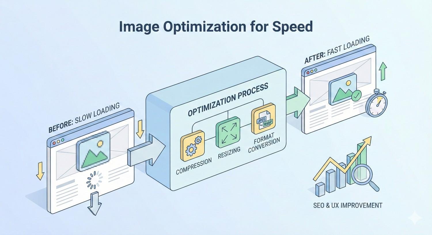
What Is Image Optimization for Speed?
Image optimization for speed is the process of reducing image file sizes and improving delivery methods without sacrificing visual quality. The goal is simple: deliver the best-looking images in the smallest possible file size, as quickly as possible.
This involves selecting appropriate file formats, applying compression algorithms, resizing images to match display dimensions, and implementing modern delivery techniques like lazy loading and CDNs. Each optimization layer compounds to create significantly faster page loads.
The technical foundation matters because search engines now measure page speed as a ranking factor. Google’s algorithms evaluate how quickly your largest content elements load, and images are frequently the culprit behind slow scores.
How Image Files Impact Website Performance
Every image on your page requires an HTTP request, bandwidth to download, and processing power to render. Unoptimized images create a cascade of performance problems that affect everything from server costs to user experience.
Large image files consume bandwidth, which slows download speeds especially on mobile networks. A single uncompressed hero image can exceed 5MB, taking several seconds to load on average connections. Multiply this across multiple images, and page loads stretch into double-digit seconds.
Browser rendering also suffers when images lack proper dimensions. Without specified width and height attributes, browsers must download images before calculating layout, causing content to shift as images load. This creates the jarring experience users associate with slow, unprofessional websites.
Server resources take a hit too. Larger files mean more data transfer, higher hosting costs, and increased strain on your infrastructure during traffic spikes.
The Connection Between Image Size and Page Load Time
File size directly correlates with load time. HTTP Archive data shows the median webpage now exceeds 2.4MB, with images comprising roughly 45% of that weight.
The math is straightforward. On a 10Mbps connection, downloading 1MB takes approximately 0.8 seconds. A page with 2MB of unoptimized images adds nearly 2 seconds to load time before any other resources are considered.
Mobile connections amplify this problem. Average 4G speeds hover around 25Mbps in optimal conditions, but real-world performance often drops to 5-10Mbps. Users on slower connections or limited data plans experience even longer waits.
Reducing image sizes from 500KB to 50KB each can cut total page weight by megabytes. This translates directly to faster Time to First Byte, quicker Largest Contentful Paint scores, and improved user perception of speed.
Why Image Optimization Matters for SEO and User Experience
Search engines and users share the same priority: fast, functional websites. Image optimization sits at the intersection of technical SEO and user experience, making it essential for sustainable organic growth.
Google has explicitly stated that page speed influences rankings. The Page Experience update formalized this by incorporating Core Web Vitals as ranking signals. Sites that load slowly face algorithmic disadvantages regardless of content quality.
Beyond rankings, speed shapes user behavior. Visitors form opinions about your site within milliseconds. Slow-loading images signal an outdated or untrustworthy experience, pushing potential customers toward faster competitors.
Core Web Vitals and Image Performance Metrics
Core Web Vitals measure real-world user experience through three specific metrics. Images directly impact two of them: Largest Contentful Paint (LCP) and Cumulative Layout Shift (CLS).
LCP measures how long it takes for the largest visible content element to render. On most pages, this is an image. Google recommends an LCP of 2.5 seconds or less for a good user experience. Unoptimized hero images frequently push LCP beyond 4 seconds, placing sites in the “poor” category.
CLS tracks unexpected layout shifts during page load. Images without defined dimensions cause significant CLS issues. When browsers don’t know an image’s size in advance, content jumps around as images load, frustrating users and hurting your CLS score.
Optimizing images addresses both metrics simultaneously. Compressed files load faster, improving LCP. Properly sized images with width and height attributes eliminate layout shifts, improving CLS.
How Slow Images Affect Bounce Rate and Conversions
Speed and engagement share a direct relationship. Research from Google indicates that as page load time increases from 1 to 3 seconds, bounce probability increases by 32%. At 5 seconds, that probability jumps to 90%.
E-commerce sites feel this impact acutely. Every additional second of load time can reduce conversions by 7% or more. For a site generating $100,000 monthly, a 2-second delay could cost $14,000 in lost revenue.
The psychology behind this is simple. Users interpret slow loading as a signal of poor quality or security concerns. They don’t wait to find out if your content is valuable; they leave and find a faster alternative.
Image optimization removes this friction. Faster pages keep visitors engaged longer, increase pages per session, and improve the likelihood of conversion actions.
Mobile Performance and Image Loading
Mobile devices now account for the majority of web traffic, yet mobile connections and processing power lag behind desktop capabilities. This makes mobile image optimization particularly critical.
Smartphones often connect through variable network conditions. A user might start browsing on WiFi, then switch to cellular while moving. Images optimized only for high-speed connections create terrible experiences during these transitions.
Device processing power also matters. Mobile browsers must decode and render images using limited CPU and memory resources. Oversized images strain these resources, causing sluggish scrolling and interface lag even after images finish downloading.
Responsive images solve this by serving appropriately sized files based on device capabilities. A smartphone doesn’t need a 2000-pixel-wide image when its screen only displays 400 pixels. Serving the right size for each device dramatically improves mobile performance.
Types of Image Formats and When to Use Each
Choosing the correct image format is the foundation of optimization. Each format uses different compression methods and supports different features, making format selection a strategic decision rather than a default choice.
The wrong format can bloat file sizes unnecessarily or degrade quality unacceptably. Understanding format strengths and limitations helps you make informed decisions for every image on your site.
Modern formats like WebP and AVIF offer significant advantages over legacy formats, but browser compatibility and workflow considerations affect adoption. The best approach balances optimization potential with practical implementation.
JPEG vs PNG vs WebP vs AVIF
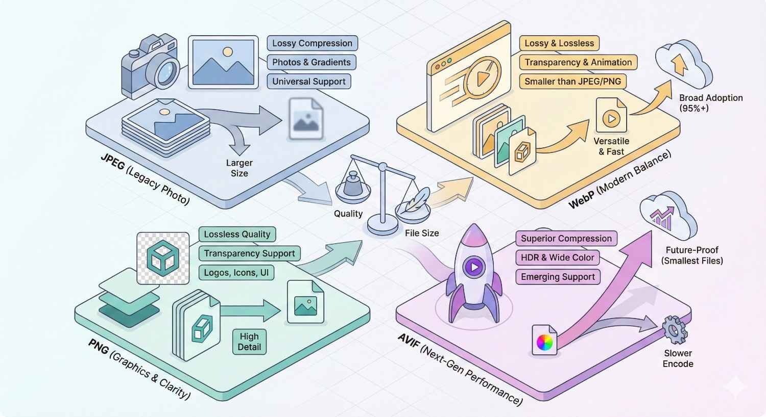
JPEG remains the workhorse for photographs and complex images with many colors. It uses lossy compression, meaning some data is discarded to reduce file size. Quality settings between 70-85% typically provide good visual results with substantial size reduction. JPEG doesn’t support transparency.
PNG excels for images requiring transparency or containing text, logos, and graphics with sharp edges. It uses lossless compression, preserving all image data. This makes PNG files larger than JPEGs for photographs but superior for graphics. PNG-8 works well for simple graphics with limited colors, while PNG-24 handles complex images with transparency.
WebP combines the best of both formats. It supports both lossy and lossless compression, transparency, and animation. Google’s testing shows WebP images are 25-34% smaller than comparable JPEGs and 26% smaller than PNGs. Browser support now exceeds 95% globally.
AVIF represents the newest generation of image formats. Based on the AV1 video codec, AVIF achieves even better compression than WebP, often 50% smaller than JPEG at equivalent quality. Browser support is growing but not yet universal, making AVIF best used with fallback formats.
Vector vs Raster Images for Web
Raster images (JPEG, PNG, WebP, AVIF) store pixel data. They work well for photographs and complex imagery but become blurry when scaled beyond their original dimensions.
Vector images (SVG) store mathematical instructions for drawing shapes. They scale infinitely without quality loss, making them ideal for logos, icons, and simple illustrations. SVG files are often tiny compared to raster equivalents and can be styled with CSS.
The choice depends on image content. Photographs must be raster. Logos and icons should be vector whenever possible. Illustrations can go either way depending on complexity.
SVG also offers accessibility benefits. Text within SVG files remains selectable and searchable, and SVG elements can include ARIA labels for screen readers.
Choosing the Right Format for Different Use Cases
Hero images and photographs: Use WebP with JPEG fallback. Apply lossy compression at 75-85% quality. Consider AVIF for maximum compression where supported.
Logos and icons: Use SVG whenever possible. For raster logos, PNG provides crisp edges. WebP works if transparency isn’t needed.
Product images: WebP offers the best balance of quality and size. E-commerce sites benefit significantly from WebP adoption due to high image volumes.
Screenshots and graphics with text: PNG preserves text clarity. WebP lossless mode also works well.
Animated content: WebP supports animation with smaller file sizes than GIF. For complex animations, consider video formats instead.
Thumbnails: Aggressive compression is acceptable since small display sizes hide quality loss. WebP at 60-70% quality works well.
How to Optimize Images for Faster Loading
Optimization involves multiple techniques working together. Compression reduces file size. Proper sizing eliminates wasted pixels. Lazy loading defers off-screen images. Responsive images serve appropriate sizes. CDNs accelerate delivery.
Each technique contributes incremental improvements. Combined, they can reduce image-related load time by 70% or more. The key is implementing all applicable techniques rather than relying on any single approach.
Start with the highest-impact changes: format conversion and compression. Then layer on delivery optimizations like lazy loading and CDNs for maximum effect.
Image Compression Techniques (Lossy vs Lossless)
Lossy compression permanently removes image data to achieve smaller files. The algorithm identifies and discards information humans are unlikely to notice. Quality settings control how aggressively data is removed.
For photographs, lossy compression at 75-85% quality typically reduces file size by 60-80% with minimal visible degradation. Below 70%, artifacts become noticeable. The sweet spot varies by image content.
Lossless compression reduces file size without removing any data. The original image can be perfectly reconstructed. Size reductions are more modest, typically 10-30%, but quality remains pristine.
Use lossy compression for photographs and complex images where slight quality loss is acceptable. Use lossless for graphics, screenshots, and images that will be edited further.
Modern tools like Squoosh, ImageOptim, and TinyPNG make compression accessible. They preview results before saving, letting you find the optimal balance for each image.
Resizing and Scaling Images Correctly
Never upload images larger than their maximum display size. A 4000-pixel-wide image displayed at 800 pixels wastes 80% of its data. Resize before uploading.
Determine the largest size each image will display across all devices and breakpoints. Add a small buffer for retina displays (typically 1.5-2x the display size). Resize to that dimension.
For responsive designs, create multiple sizes of each image. A hero image might need versions at 400px, 800px, 1200px, and 1600px widths to serve different viewport sizes efficiently.
Batch processing tools like ImageMagick, Sharp, or Photoshop actions automate resizing for large image libraries. CMS plugins can also generate multiple sizes automatically on upload.
Implementing Lazy Loading
Lazy loading defers image loading until images approach the viewport. Instead of downloading all images immediately, browsers load images just before users scroll to them.
This dramatically improves initial page load. A page with 50 images might only load 5 initially, reducing initial payload by 90%. Remaining images load progressively as users scroll.
Native lazy loading requires only adding loading=”lazy” to image tags:
html
Copy
<img src=”image.jpg“ loading=”lazy“ alt=”Description“>
Browser support for native lazy loading exceeds 90%. For broader compatibility or more control, JavaScript libraries like lazysizes provide additional features.
Exclude above-the-fold images from lazy loading. Your hero image and any images visible without scrolling should load immediately to avoid blank spaces during initial render.
Using Responsive Images with srcset
The srcset attribute tells browsers which image sizes are available, letting them choose the most appropriate version based on device capabilities.
html
Copy
<img src=”image-800.jpg“
srcset=”image-400.jpg 400w,
image-800.jpg 800w,
image-1200.jpg 1200w“
sizes=”(max-width: 600px) 400px,
(max-width: 1000px) 800px,
1200px“
alt=”Description“>
The sizes attribute tells browsers how large the image will display at different viewport widths. Browsers combine this information with device pixel density to select the optimal file.
This approach serves small files to mobile devices and larger files to desktop displays automatically. Users get appropriately sized images without manual device detection.
Picture elements offer even more control, allowing different image formats or art direction based on viewport:
html
Copy
<picture>
<source srcset=”image.avif“ type=”image/avif“>
<source srcset=”image.webp“ type=”image/webp“>
<img src=”image.jpg“ alt=”Description“>
</picture>
Leveraging Content Delivery Networks (CDNs)
CDNs distribute your images across global server networks, serving files from locations geographically close to each user. This reduces latency and accelerates delivery.
A user in Tokyo requesting an image from a US-based server experiences significant latency. With a CDN, that same image loads from a Tokyo edge server, cutting round-trip time dramatically.
Image-specific CDNs like Cloudinary, imgix, and Cloudflare Images go further. They automatically optimize images on delivery, converting formats, resizing, and compressing based on each request’s context.
These services can transform a single uploaded image into dozens of optimized variants without manual processing. They detect browser capabilities and serve WebP or AVIF automatically to supporting browsers.
CDN implementation typically involves changing image URLs to point to the CDN domain. Many services offer WordPress plugins or CMS integrations that handle this automatically.
Best Image Optimization Tools and Software
The right tools make optimization practical at scale. Manual optimization works for small sites, but growing image libraries require automated solutions.
Tool selection depends on your technical capabilities, CMS platform, and budget. Free tools handle basic needs effectively. Premium solutions add automation, API access, and advanced features.
Consider your workflow when choosing tools. The best tool is one your team will actually use consistently.
Free Image Compression Tools
Squoosh (squoosh.app) offers browser-based compression with real-time previews. It supports all major formats including WebP and AVIF, with granular quality controls. Excellent for one-off optimization.
TinyPNG/TinyJPG provides simple drag-and-drop compression. The free tier allows 500 images monthly. Results are consistently good with minimal quality loss.
ImageOptim (Mac) and FileOptimizer (Windows) are desktop applications that batch-process images. They strip metadata and apply lossless compression automatically.
GIMP offers full image editing capabilities including export optimization. More complex than dedicated compression tools but useful when editing and optimization happen together.
XnConvert handles batch processing with format conversion, resizing, and compression. Supports over 500 formats and runs on all major operating systems.
WordPress Plugins for Image Optimization
ShortPixel compresses images on upload and can bulk-optimize existing libraries. It offers lossy, glossy, and lossless compression levels. The free tier includes 100 images monthly.
Imagify from the WP Rocket team provides similar functionality with a clean interface. It integrates well with other optimization plugins and supports WebP conversion.
Smush offers unlimited free compression for images under 5MB. The pro version adds WebP conversion and CDN delivery.
EWWW Image Optimizer can process images locally without sending data to external servers, addressing privacy concerns. It supports WebP and handles bulk optimization efficiently.
Optimole takes a different approach, serving images through its CDN with real-time optimization. It automatically adjusts quality and size based on visitor devices.
Enterprise and API-Based Solutions
Cloudinary provides comprehensive image management with transformation APIs, automatic optimization, and global CDN delivery. Pricing scales with usage, making it suitable for high-volume sites.
imgix focuses on real-time image processing through URL parameters. It integrates with existing storage solutions and offers extensive transformation options.
Cloudflare Images combines storage, optimization, and delivery in one service. It automatically serves appropriate formats and sizes based on request context.
Fastly Image Optimizer integrates with Fastly’s CDN for edge-based image processing. It suits enterprises already using Fastly for content delivery.
These solutions handle optimization automatically, reducing manual work for large image libraries. API access enables integration with custom workflows and applications.
Browser-Based vs Desktop Applications
Browser-based tools require no installation and work across operating systems. They’re ideal for occasional use and team environments where installing software isn’t practical. Limitations include file size caps and dependency on internet connectivity.
Desktop applications offer faster processing for large batches and work offline. They typically provide more control over compression settings and support larger files. Installation and updates require more management.
Hybrid approaches combine both. Upload images through a browser interface, process on remote servers, and download optimized results. This balances convenience with processing power.
For most teams, a combination works best. Use browser tools for quick one-off optimizations and desktop or server-based solutions for bulk processing.
How to Measure Image Optimization Performance
Measurement validates optimization efforts and identifies remaining opportunities. Without data, you’re guessing whether changes actually improved performance.
Multiple tools provide different perspectives on image performance. Use them together for a complete picture of how images affect your site speed.
Establish baselines before optimizing, then measure again after changes. This quantifies improvements and demonstrates ROI to stakeholders.
Using Google PageSpeed Insights
PageSpeed Insights analyzes any URL and provides specific image optimization recommendations. It tests both mobile and desktop performance, showing scores and detailed diagnostics.
The tool identifies images that could benefit from next-gen formats, proper sizing, or additional compression. Each recommendation includes estimated savings in bytes and seconds.
Scores range from 0-100, with 90+ considered good. Image-related issues frequently account for significant point deductions on unoptimized sites.
Run PageSpeed Insights on your most important pages: homepage, key landing pages, and high-traffic content. Address the largest opportunities first for maximum impact.
The tool also shows Core Web Vitals data from real users when available, providing insight into actual field performance rather than just lab conditions.
Lighthouse Audits for Images
Lighthouse provides more detailed technical audits than PageSpeed Insights. Access it through Chrome DevTools (Audits tab) or as a command-line tool for automated testing.
Image-specific audits include:
- Properly size images
- Defer offscreen images
- Serve images in next-gen formats
- Efficiently encode images
- Image elements have explicit width and height
Each audit explains the issue, lists affected images, and estimates potential savings. This granular detail helps prioritize optimization work.
Lighthouse also measures LCP element identification, showing which image (if any) is your largest contentful paint. Optimizing this specific image often yields the biggest performance gains.
Run Lighthouse in incognito mode to avoid extension interference. Test multiple times and average results, as scores can vary between runs.
Key Metrics to Track (LCP, CLS, File Size)
Largest Contentful Paint (LCP) measures when the largest content element renders. For image-heavy pages, this is usually an image. Target: under 2.5 seconds.
Track LCP in Google Search Console’s Core Web Vitals report for site-wide trends. Use PageSpeed Insights for page-specific analysis. Monitor whether optimization efforts move LCP in the right direction.
Cumulative Layout Shift (CLS) measures visual stability. Images without dimensions cause layout shifts. Target: under 0.1.
After adding width and height attributes to images, verify CLS improvements in field data. Lab tests may not capture all real-world shift scenarios.
Total image weight indicates overall optimization status. Track average image size and total image bytes per page. Aim for under 500KB total image weight on typical pages.
Image requests count how many images each page loads. Fewer requests mean faster initial loads. Lazy loading reduces initial requests without removing images.
What is a good image file size for websites? Most web images should fall between 50KB and 200KB after optimization. Hero images might reach 200-300KB for quality, while thumbnails should stay under 30KB. Total image weight per page ideally remains under 500KB.
How much can image optimization improve page speed? Comprehensive image optimization typically reduces page load time by 40-70%. Sites with completely unoptimized images may see even larger improvements. The impact depends on how many images exist and their current optimization state.
Common Image Optimization Mistakes to Avoid
Even well-intentioned optimization efforts can backfire. Understanding common mistakes helps you avoid them and achieve better results.
These errors range from technical missteps to strategic oversights. Some damage user experience. Others leave performance gains on the table.
Review your current approach against these pitfalls. Correcting mistakes often yields quick wins without additional optimization work.
Over-Compression and Quality Loss
Aggressive compression saves bytes but destroys visual quality. Artifacts, banding, and blurriness make images look unprofessional and damage brand perception.
The temptation to minimize file size leads to quality settings below acceptable thresholds. A 20KB image that looks terrible serves no one better than a 60KB image that looks good.
Find the quality threshold for each image type. Photographs typically tolerate 75-85% JPEG quality. Graphics with text need higher quality to maintain readability. Test compression levels visually before applying site-wide.
Remember that quality loss is permanent with lossy compression. Always keep original files and compress copies. You can’t recover quality from an over-compressed image.
Ignoring Alt Text and Accessibility
Alt text serves multiple purposes: accessibility for screen reader users, context when images fail to load, and SEO signals for search engines. Skipping alt text fails all three.
Every meaningful image needs descriptive alt text. Describe what the image shows and its relevance to surrounding content. Keep descriptions concise but informative.
Decorative images that add no information should have empty alt attributes (alt=””), telling screen readers to skip them. This differs from missing alt attributes, which screen readers may try to describe using filenames.
Alt text also contributes to image search visibility. Relevant, descriptive alt text helps images appear in Google Image Search results, driving additional traffic.
Not Optimizing for Retina Displays
Retina and high-DPI displays pack more pixels into the same physical space. Images sized for standard displays appear blurry on these screens.
The solution is serving images at 1.5-2x the display dimensions. An image displayed at 400px wide needs to be 600-800px wide to appear sharp on retina displays.
Responsive images with srcset handle this automatically. Include 2x versions in your srcset, and browsers select appropriate files based on device pixel ratio.
Balance retina optimization with file size concerns. Not every image needs a 2x version. Hero images and product photos benefit most. Small thumbnails and decorative elements matter less.
Image Optimization for E-commerce Websites
E-commerce sites face unique image optimization challenges. Product images must look excellent to drive purchases, yet sites often contain thousands of images that collectively impact performance.
The stakes are higher for online stores. Slow product pages directly reduce revenue. Poor image quality reduces conversion rates. Finding the right balance requires strategic thinking.
Automation becomes essential at e-commerce scale. Manual optimization of thousands of product images isn’t practical. Systematic approaches and automated tools make optimization sustainable.
Product Image Best Practices
Consistency matters. Use uniform dimensions, backgrounds, and styling across product images. This creates a professional appearance and simplifies optimization workflows.
Multiple angles require multiple optimizations. Each product view needs individual attention. Prioritize primary images that appear in listings and search results.
Zoom functionality demands higher resolution. If users can zoom, you need larger source images. Serve appropriately sized thumbnails for listings, then load high-resolution versions only when zoom is activated.
Background removal reduces file sizes and improves visual consistency. White or transparent backgrounds compress more efficiently than complex scenes.
Batch processing handles large catalogs efficiently. Set up automated workflows that optimize images on upload, applying consistent compression and format conversion.
Balancing Quality and Speed for Online Stores
Product images directly influence purchase decisions. Shoppers can’t touch or examine products physically, so images must convey quality, details, and features convincingly.
This creates tension with optimization goals. Aggressive compression that works for blog images may unacceptably degrade product photos. Finding the right balance requires testing.
A/B test different quality levels on product pages. Measure both page speed metrics and conversion rates. The optimal setting maximizes conversions while maintaining acceptable load times.
Consider different optimization levels for different contexts. Category pages with many thumbnails can use more aggressive compression. Individual product pages with fewer, larger images can prioritize quality.
Lazy loading is particularly valuable for e-commerce. Category pages may contain dozens of product images. Loading only visible images dramatically improves initial page performance.
Advanced Image Optimization Strategies
Basic optimization handles most needs, but advanced strategies unlock additional performance gains. These techniques require more technical implementation but deliver meaningful improvements.
Consider these approaches after implementing fundamentals. They build on basic optimization rather than replacing it.
Advanced strategies often involve automation, making them more sustainable for large or frequently updated sites.
Automated Image Optimization Pipelines
Manual optimization doesn’t scale. Automated pipelines process images consistently without human intervention, ensuring every image meets optimization standards.
Build pipelines integrate optimization into development workflows. Tools like Sharp, ImageMagick, or Squoosh CLI process images during build steps, outputting optimized versions automatically.
Upload pipelines optimize images when content creators add them. CMS plugins or serverless functions intercept uploads, process images, and store optimized versions.
CDN pipelines optimize on delivery. Services like Cloudinary or imgix transform images in real-time based on request parameters, eliminating the need for pre-optimization.
Choose pipeline architecture based on your technical capabilities and content workflow. Simpler approaches work for smaller sites. Complex pipelines suit high-volume operations.
Next-Gen Formats and Browser Compatibility
WebP and AVIF offer superior compression but require fallback strategies for older browsers. Implementing next-gen formats correctly maximizes benefits while maintaining compatibility.
Picture element provides the cleanest solution:
html
Copy
<picture>
<source srcset=”image.avif“ type=”image/avif“>
<source srcset=”image.webp“ type=”image/webp“>
<img src=”image.jpg“ alt=”Description“>
</picture>
Browsers select the first supported format, falling back to JPEG for older browsers. This serves optimal formats without breaking compatibility.
Server-side content negotiation examines Accept headers and serves appropriate formats automatically. This keeps HTML simple but requires server configuration.
CDN-based format selection handles negotiation at the edge. Services detect browser capabilities and serve optimal formats without origin server changes.
Monitor format adoption in your analytics. As browser support grows, you may eventually drop legacy format fallbacks entirely.
Image SEO: File Names, Alt Tags, and Structured Data
Image optimization extends beyond performance to search visibility. Properly optimized images can drive significant traffic through image search.
File names should be descriptive and keyword-relevant. “blue-running-shoes-nike-pegasus.jpg” provides more context than “IMG_4532.jpg”. Use hyphens to separate words.
Alt text describes image content for accessibility and search engines. Include relevant keywords naturally, but prioritize accurate description over keyword stuffing.
Structured data helps search engines understand image context. Product schema includes image properties. Article schema can reference featured images. This structured context improves how images appear in search results.
Image sitemaps help search engines discover images, particularly those loaded via JavaScript or in image galleries. Include image URLs, captions, and titles in your sitemap.
How Long Does Image Optimization Take to Impact Rankings?
SEO improvements don’t happen overnight. Understanding realistic timelines helps set appropriate expectations and measure progress accurately.
Image optimization affects rankings through page speed improvements, which Google measures and incorporates into algorithms. The timeline depends on crawl frequency, competitive landscape, and the magnitude of improvements.
Patience and consistent measurement reveal the true impact of optimization efforts.
Realistic Timelines for Speed Improvements
Immediate effects appear in lab testing tools. PageSpeed Insights and Lighthouse scores improve as soon as optimized images deploy. These changes are visible within hours.
Field data takes longer to reflect changes. Google’s Core Web Vitals report uses 28-day rolling averages from real users. Expect 4-6 weeks before field metrics fully reflect optimizations.
Ranking impacts follow field data improvements. Once Google recognizes sustained speed improvements, ranking adjustments may occur. This typically takes 2-4 months for meaningful movement.
Competitive context matters. If competitors also optimize, relative improvements may be smaller. If you’re catching up to already-fast competitors, expect modest ranking gains. If you’re moving from slow to fast in a slow-loading niche, impacts may be larger.
Measuring ROI from Image Optimization
Track metrics before and after optimization to quantify returns. Key measurements include:
Page speed metrics: LCP, total page weight, image bytes. Document baseline values and improvements.
Organic traffic: Monitor search traffic to optimized pages. Account for seasonality and other ranking factors when attributing changes.
Engagement metrics: Bounce rate, time on page, pages per session. Faster pages typically improve all three.
Conversion rates: For e-commerce and lead generation sites, track whether speed improvements correlate with conversion changes.
Hosting costs: Reduced bandwidth consumption may lower hosting expenses, particularly for high-traffic sites.
Calculate ROI by comparing implementation costs (tools, time, services) against measurable benefits (increased conversions, reduced hosting costs, traffic growth).
Conclusion
Image optimization represents one of the highest-impact technical SEO improvements available to most websites. The techniques covered here, from format selection and compression to lazy loading and CDN delivery, work together to dramatically reduce page weight and improve load times.
At White Label SEO Service, we help businesses implement comprehensive optimization strategies that drive measurable improvements in Core Web Vitals, search rankings, and user engagement. Image optimization is one component of the technical foundation that supports sustainable organic growth.
Ready to accelerate your website performance? Contact our team to discuss how image optimization fits into your broader SEO strategy and start seeing faster load times within weeks.
Frequently Asked Questions About Image Optimization
What is the best image format for website speed?
WebP currently offers the best balance of compression efficiency and browser support for most use cases. It produces files 25-34% smaller than JPEG with equivalent quality and supports transparency. AVIF provides even better compression but has less universal browser support. Use WebP as your primary format with JPEG fallback for maximum compatibility.
How do I compress images without losing quality?
Use lossless compression for images where quality is critical, or apply lossy compression at quality settings between 75-85% for photographs. Tools like Squoosh let you preview compression results before saving, helping you find the threshold where quality loss becomes noticeable. Always keep original files and compress copies.
Does image optimization affect SEO rankings?
Yes, image optimization directly impacts SEO through page speed improvements. Google uses Core Web Vitals as ranking signals, and images heavily influence LCP scores. Faster pages also reduce bounce rates and improve user engagement metrics, which indirectly support rankings. Properly optimized images with descriptive alt text also appear in image search results.
What size should images be for web pages?
Size images to their maximum display dimensions plus a buffer for retina displays. A hero image displayed at 1200px wide should be 1800-2400px wide to appear sharp on high-DPI screens. File size targets vary: aim for under 200KB for large images and under 50KB for thumbnails. Total image weight per page should ideally stay under 500KB.
How do I enable lazy loading for images?
Add the loading=”lazy” attribute to image tags: <img src=”image.jpg” loading=”lazy” alt=”Description”>. This native browser feature defers loading until images approach the viewport. Exclude above-the-fold images from lazy loading to ensure they render immediately. For more control, JavaScript libraries like lazysizes offer additional configuration options.
Can I automate image optimization for my website?
Yes, automation is essential for sites with many images. WordPress plugins like ShortPixel or Imagify optimize images on upload automatically. Build tools can process images during deployment. CDN services like Cloudinary optimize images on delivery without manual intervention. Choose automation approaches that fit your technical capabilities and content workflow.
How do I know if my images are slowing down my website?
Run your pages through Google PageSpeed Insights or Lighthouse. These tools identify specific images causing performance issues and estimate potential savings from optimization. Look for recommendations about properly sizing images, serving next-gen formats, and efficiently encoding images. The tools quantify how much each issue affects your overall performance score.


