
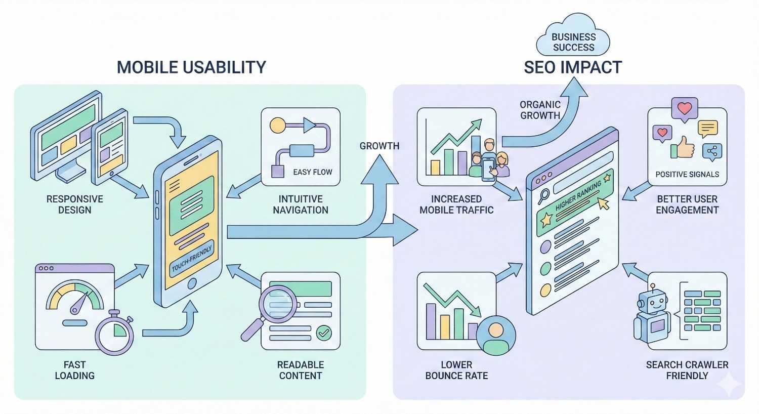
Mobile usability issues directly impact your search rankings, user engagement, and conversion rates. With Google’s mobile-first indexing now standard, sites failing mobile usability tests face significant visibility losses in organic search results.
This matters because over 60% of all web traffic comes from mobile devices. Poor mobile experience translates to lost revenue and wasted marketing spend.
This guide covers diagnosis, fixes, and long-term monitoring strategies for every common mobile usability problem affecting your SEO performance.
What Is Mobile Usability and Why It Matters for SEO
Mobile usability refers to how effectively users can navigate, read, and interact with your website on smartphones and tablets. It encompasses touch target sizing, text readability, viewport configuration, page speed, and overall user experience on smaller screens.
Google evaluates mobile usability as a direct ranking factor. Sites that fail mobile usability standards face reduced visibility in search results, particularly since mobile-first indexing became the default crawling method for all websites.
How Mobile Usability Impacts Search Rankings
Google’s algorithm uses mobile usability signals to determine search rankings. When Googlebot crawls your site, it primarily uses the mobile version to assess content quality and user experience. Sites with mobile usability errors receive lower rankings than competitors with optimized mobile experiences.
The connection between mobile usability and rankings operates through multiple mechanisms. Core Web Vitals measure loading performance, interactivity, and visual stability on mobile devices. Page experience signals evaluate whether users can easily accomplish their goals. Mobile-friendly status determines whether your pages appear in mobile search results at all.
According to Google’s Search Central documentation, mobile-first indexing means Google predominantly uses the mobile version of content for indexing and ranking. Sites without proper mobile optimization essentially compete with one hand tied behind their back.
The Business Cost of Poor Mobile Experience
Poor mobile usability creates measurable business losses. Users encountering mobile usability problems abandon sites quickly, increasing bounce rates and reducing time on page. These behavioral signals further damage search rankings, creating a negative feedback loop.
E-commerce sites face particularly severe consequences. Research from Google shows that 53% of mobile users abandon sites that take longer than three seconds to load. Each additional second of load time increases bounce probability significantly.
Beyond immediate traffic losses, poor mobile usability damages brand perception. Users who struggle with your mobile site associate that frustration with your brand. They’re less likely to return, recommend your business, or convert on future visits regardless of device.
Common Mobile Usability Issues That Hurt Rankings
Google Search Console identifies specific mobile usability errors that prevent pages from ranking effectively. Understanding these issues helps prioritize fixes based on their impact on both user experience and search visibility.
Text Too Small to Read
Text that requires zooming to read fails mobile usability standards. Google expects body text to be legible without user intervention. The minimum recommended font size is 16 pixels for body text, though some guidelines suggest 14 pixels as an absolute minimum.
Small text forces users to pinch and zoom, disrupting their reading flow and increasing cognitive load. This friction causes users to leave pages before consuming content or completing conversions.
The issue often stems from desktop-first design approaches where developers set fixed pixel sizes that work on large screens but become illegible on mobile devices.
Clickable Elements Too Close Together
Touch targets positioned too close together cause accidental taps. Users attempting to click one link or button inadvertently activate adjacent elements. This frustration leads to navigation errors, form submission problems, and abandoned sessions.
Google recommends touch targets be at least 48×48 CSS pixels with adequate spacing between them. Elements smaller than this threshold or positioned within 8 pixels of each other trigger mobile usability errors.
Navigation menus, footer links, and form elements commonly exhibit this problem. Dense link structures that work with mouse precision fail completely with finger-based interaction.
Content Wider Than Screen
Horizontal scrolling indicates content width problems. When page elements extend beyond the viewport, users must scroll horizontally to view complete content. This breaks the natural vertical scrolling pattern and creates disorienting navigation experiences.
Common causes include fixed-width elements, images without responsive sizing, tables with absolute widths, and CSS that doesn’t account for viewport constraints. Even a single oversized element can trigger this error for an entire page.
Mobile Viewport Not Configured
Missing or incorrectly configured viewport meta tags prevent browsers from rendering pages appropriately for mobile screens. Without viewport configuration, mobile browsers display pages at desktop widths, making content appear tiny and requiring zoom to read.
The viewport meta tag tells browsers how to control page dimensions and scaling. Its absence signals that a page wasn’t designed with mobile users in mind, triggering automatic mobile usability failures.
Incompatible Plugins and Flash Content
Flash content and certain plugins don’t function on mobile devices. Pages relying on these technologies display broken content or error messages to mobile users. While Flash usage has declined dramatically, legacy sites still occasionally contain Flash elements.
Beyond Flash, some embedded content types and third-party plugins lack mobile support. Video players, interactive tools, and custom widgets may require updates or replacements to function across all devices.
How to Diagnose Mobile Usability Problems
Effective diagnosis requires multiple tools and testing methods. Each approach reveals different aspects of mobile usability, and comprehensive audits combine automated testing with manual verification.
Using Google Search Console Mobile Usability Report
Google Search Console provides the most authoritative mobile usability data because it reflects how Google actually evaluates your pages. The Mobile Usability report shows which pages have errors and categorizes issues by type.
Access the report through the Experience section in Search Console. The report displays affected page counts for each error type and lists specific URLs with problems. Google updates this data as it recrawls pages, so fixes appear in the report after Googlebot processes updated pages.
The report identifies five primary error categories: text too small, clickable elements too close, content wider than screen, viewport not set, and incompatible plugins. Each error links to affected URLs for targeted remediation.
Google Mobile-Friendly Test Tool
The Mobile-Friendly Test evaluates individual URLs for mobile usability compliance. Enter any URL to receive immediate feedback on mobile-friendliness status along with specific issues detected.
This tool provides screenshot previews showing how Googlebot renders your page on mobile devices. Rendering issues, blocked resources, and layout problems become visible through these previews.
Use this tool for quick checks during development, after deploying changes, or when investigating specific pages flagged in Search Console. The tool also identifies page loading issues that might affect mobile usability assessment.
PageSpeed Insights Mobile Analysis
PageSpeed Insights combines lab data with field data to evaluate mobile performance. The tool runs Lighthouse audits and pulls real-user metrics from the Chrome User Experience Report when available.
Mobile-specific analysis reveals Core Web Vitals performance, accessibility issues, and best practice violations. The tool provides specific recommendations with estimated impact, helping prioritize optimization efforts.
Pay particular attention to the mobile score versus desktop score. Significant gaps indicate mobile-specific problems requiring attention. The diagnostics section details exactly which elements cause performance issues.
Chrome DevTools Device Emulation
Chrome DevTools includes device emulation for testing responsive behavior across screen sizes. Access DevTools with F12 or right-click and select Inspect, then toggle device toolbar to simulate mobile viewports.
Device emulation allows testing specific device dimensions, pixel ratios, and touch interactions. You can throttle network speed and CPU to simulate real mobile conditions more accurately.
While emulation helps identify obvious issues, it doesn’t perfectly replicate actual device behavior. Use emulation for rapid iteration during development, but verify with real devices before considering issues resolved.
Real Device Testing Methods
Physical device testing catches issues that emulators miss. Actual smartphones and tablets reveal touch target problems, rendering quirks, and performance issues that don’t appear in simulated environments.
Maintain a testing device library covering major platforms and screen sizes. At minimum, test on recent iOS and Android devices with different screen dimensions. Budget devices with limited processing power often reveal performance problems that flagship phones mask.
Browser testing services like BrowserStack and LambdaTest provide access to real devices remotely. These services enable testing across hundreds of device and browser combinations without maintaining physical hardware.
Step-by-Step Fixes for Mobile Usability Issues
Resolving mobile usability errors requires systematic implementation of responsive design principles, proper sizing standards, and modern web technologies. Each fix category addresses specific error types identified in diagnostic tools.
Implementing Responsive Design Correctly
Responsive design adapts layouts to any screen size through flexible grids, scalable images, and CSS media queries. Proper implementation eliminates content width errors and creates consistent experiences across devices.
Setting the Mobile Viewport Meta Tag
Add the viewport meta tag to every page’s head section:
html
Copy
<meta name=”viewport“ content=”width=device-width, initial-scale=1“>
This tag instructs browsers to set viewport width equal to device width and establish initial zoom at 100%. Without this tag, mobile browsers assume pages are designed for desktop widths.
Avoid setting maximum-scale=1 or user-scalable=no as these prevent users from zooming, which creates accessibility problems. Users with vision impairments need zoom capability to read content comfortably.
Using Flexible Grid Layouts
Replace fixed-width layouts with flexible grids using percentage-based widths or CSS Grid and Flexbox. These layout methods automatically adjust to available space.
CSS Grid provides powerful two-dimensional layout control:
css
Copy
.container {
display: grid;
grid-template-columns: repeat(auto-fit, minmax(300px, 1fr));
gap: 1rem;
}
Flexbox handles one-dimensional layouts effectively:
css
Copy
.flex-container {
display: flex;
flex-wrap: wrap;
gap: 1rem;
}
.flex-item {
flex: 1 1 300px;
}
Both approaches create layouts that reflow naturally as viewport dimensions change.
CSS Media Queries Best Practices
Media queries apply different styles based on viewport characteristics. Structure media queries mobile-first, starting with base styles for small screens and adding complexity for larger viewports.
css
Copy
/* Base mobile styles */
.content {
padding: 1rem;
font-size: 16px;
}
/* Tablet and larger */
@media (min-width: 768px) {
.content {
padding: 2rem;
font-size: 18px;
}
}
/* Desktop */
@media (min-width: 1024px) {
.content {
max-width: 1200px;
margin: 0 auto;
}
}
Common breakpoints include 480px, 768px, 1024px, and 1280px, though exact values should match your design requirements rather than arbitrary device categories.
Fixing Font Size and Readability Issues
Readable text requires appropriate sizing, adequate contrast, and proper spacing. These factors combine to determine whether users can comfortably consume content on mobile devices.
Minimum Font Size Requirements
Set body text to at least 16 pixels. This size ensures readability without zooming on most devices. Smaller sizes may work for secondary content like captions or legal text, but primary content should meet this minimum.
Use relative units like rem or em instead of pixels for better scalability:
css
Copy
html {
font-size: 16px; /* Base size */
}
body {
font-size: 1rem; /* 16px */
}
h1 {
font-size: 2rem; /* 32px */
}
.small-text {
font-size: 0.875rem; /* 14px */
}
Relative units allow users to adjust base font sizes in browser settings, improving accessibility for users who need larger text.
Line Height and Spacing Optimization
Line height affects readability significantly. Text with insufficient line spacing appears cramped and becomes difficult to track across lines. Set line height between 1.4 and 1.6 for body text.
css
Copy
body {
line-height: 1.5;
}
p {
margin-bottom: 1em;
}
Paragraph spacing provides visual breaks that help users process content in digestible chunks. Adequate margins between text blocks reduce cognitive load and improve comprehension.
Optimizing Touch Targets and Tap Elements
Touch targets must accommodate finger-based interaction. Unlike mouse cursors with pixel-level precision, fingers cover substantial screen area and lack fine control.
Minimum Touch Target Sizes
Google recommends touch targets of at least 48×48 CSS pixels. Apple’s Human Interface Guidelines suggest 44×44 points as minimum. Meeting both standards ensures compatibility across platforms.
css
Copy
.button,
.link,
.tap-target {
min-height: 48px;
min-width: 48px;
padding: 12px 16px;
}
Even if visual elements appear smaller, the tappable area should meet minimum dimensions. Use padding to expand touch targets without changing visual appearance.
Spacing Between Interactive Elements
Maintain at least 8 pixels of space between adjacent touch targets. This spacing prevents accidental activation of wrong elements when users tap near boundaries.
css
Copy
.nav-links a {
display: inline-block;
padding: 12px 16px;
margin: 4px;
}
.button-group .button {
margin: 8px;
}
Navigation menus and form elements commonly need spacing adjustments. Review any area where multiple interactive elements cluster together.
Resolving Content Width Problems
Content width issues cause horizontal scrolling and viewport overflow. Fixing these problems requires identifying oversized elements and applying responsive constraints.
Fixing Horizontal Scroll Issues
Add global overflow control to prevent horizontal scrolling:
css
Copy
html, body {
overflow-x: hidden;
max-width: 100%;
}
* {
box-sizing: border-box;
}
The box-sizing: border-box declaration ensures padding and borders don’t add to element widths, preventing unexpected overflow.
Identify specific overflow sources using browser DevTools. The Elements panel highlights elements extending beyond viewport boundaries. Common culprits include fixed-width tables, pre-formatted code blocks, and embedded content.
Image and Media Scaling Solutions
Make images responsive by default:
css
Copy
img {
max-width: 100%;
height: auto;
}
This rule ensures images scale down to fit containers while maintaining aspect ratios. For background images, use background-size: cover or background-size: contain depending on desired behavior.
Videos and iframes require wrapper elements for responsive sizing:
css
Copy
.video-wrapper {
position: relative;
padding-bottom: 56.25%; /* 16:9 aspect ratio */
height: 0;
}
.video-wrapper iframe {
position: absolute;
top: 0;
left: 0;
width: 100%;
height: 100%;
}
Tables need horizontal scroll containers or responsive redesigns:
css
Copy
.table-wrapper {
overflow-x: auto;
-webkit-overflow-scrolling: touch;
}
Removing Incompatible Technologies
Legacy technologies require replacement with modern alternatives that function across all devices and browsers.
Flash Alternatives and Modern Solutions
HTML5 video replaces Flash video players completely. Convert Flash video content to MP4 format and use native video elements:
html
Copy
<video controls>
<source src=”video.mp4“ type=”video/mp4“>
<source src=”video.webm“ type=”video/webm“>
</video>
Interactive Flash content requires rebuilding with JavaScript, CSS animations, or Canvas/WebGL for complex graphics. Libraries like GreenSock (GSAP) provide animation capabilities matching or exceeding Flash.
Plugin Replacement Strategies
Audit all third-party plugins for mobile compatibility. Replace incompatible plugins with modern alternatives or custom implementations.
For embedded content, verify that providers offer responsive embed codes. Most major platforms like YouTube, Vimeo, and social networks provide mobile-compatible embed options.
Custom functionality built on outdated plugins may require development work to modernize. Prioritize replacements based on traffic to affected pages and business importance of the functionality.
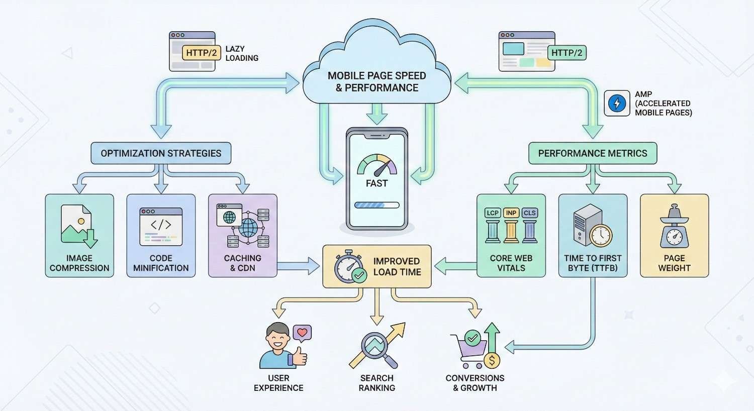
Mobile Page Speed and Performance Optimization
Page speed directly affects both user experience and search rankings. Mobile users on cellular connections face bandwidth and latency constraints that make performance optimization critical.
Core Web Vitals for Mobile
Core Web Vitals measure real-world user experience through three metrics: Largest Contentful Paint (LCP), First Input Delay (FID), and Cumulative Layout Shift (CLS). Google uses these metrics as ranking signals.
Largest Contentful Paint (LCP) Optimization
LCP measures loading performance by timing when the largest content element becomes visible. Good LCP scores are 2.5 seconds or faster. Scores above 4 seconds indicate poor performance.
Optimize LCP by:
- Eliminating render-blocking resources
- Optimizing and compressing images
- Preloading critical resources
- Using efficient caching
- Minimizing server response time
The largest content element is typically a hero image, video thumbnail, or large text block. Identify your LCP element using PageSpeed Insights and prioritize its loading.
First Input Delay (FID) Improvements
FID measures interactivity by timing the delay between user interaction and browser response. Good FID scores are 100 milliseconds or less. Scores above 300 milliseconds indicate poor interactivity.
Note: FID is being replaced by Interaction to Next Paint (INP) as a Core Web Vital. INP measures responsiveness throughout the entire page lifecycle rather than just first interaction.
Improve FID and INP by:
- Breaking up long JavaScript tasks
- Removing unused JavaScript
- Minimizing main thread work
- Reducing third-party script impact
Heavy JavaScript execution blocks the main thread, preventing browsers from responding to user input. Code splitting and lazy loading reduce initial JavaScript payload.
Cumulative Layout Shift (CLS) Fixes
CLS measures visual stability by quantifying unexpected layout shifts. Good CLS scores are 0.1 or less. Scores above 0.25 indicate poor visual stability.
Prevent layout shifts by:
- Setting explicit dimensions on images and videos
- Reserving space for ads and embeds
- Avoiding inserting content above existing content
- Using transform animations instead of layout-triggering properties
Images without width and height attributes cause shifts when they load. Always specify dimensions:
html
Copy
<img src=”image.jpg“ width=”800“ height=”600“ alt=”Description“>
Mobile Image Optimization Techniques
Images typically constitute the largest portion of page weight. Optimizing images dramatically improves mobile load times.
Use modern formats like WebP and AVIF that provide superior compression:
html
Copy
<picture>
<source srcset=”image.avif“ type=”image/avif“>
<source srcset=”image.webp“ type=”image/webp“>
<img src=”image.jpg“ alt=”Description“>
</picture>
Implement responsive images to serve appropriately sized files:
html
Copy
<img
srcset=”image-400.jpg 400w,
image-800.jpg 800w,
image-1200.jpg 1200w“
sizes=”(max-width: 600px) 400px,
(max-width: 1000px) 800px,
1200px“
src=”image-800.jpg“
alt=”Description“>
Lazy load images below the fold:
html
Copy
<img src=”image.jpg“ loading=”lazy“ alt=”Description“>
Reducing Mobile JavaScript Execution
JavaScript execution consumes CPU resources and blocks rendering. Mobile devices with limited processing power suffer more from heavy JavaScript than desktop computers.
Audit JavaScript bundles to identify unnecessary code. Tools like Webpack Bundle Analyzer visualize bundle composition. Remove unused libraries and dead code.
Defer non-critical JavaScript:
html
Copy
<script src=”analytics.js“ defer></script>
Load third-party scripts asynchronously:
html
Copy
<script src=”widget.js“ async></script>
Consider removing or replacing heavy frameworks with lighter alternatives for simple sites. A marketing page doesn’t need the same JavaScript framework as a complex web application.
Mobile Caching Strategies
Effective caching reduces repeat visit load times and decreases server load. Configure caching headers appropriately for different resource types.
Static assets like images, CSS, and JavaScript should have long cache durations:
Copy
Cache-Control: public, max-age=31536000, immutable
HTML pages need shorter cache times or validation-based caching:
Copy
Cache-Control: no-cache
ETag: “abc123”
Service workers enable advanced caching strategies for progressive web apps, including offline functionality and background sync.
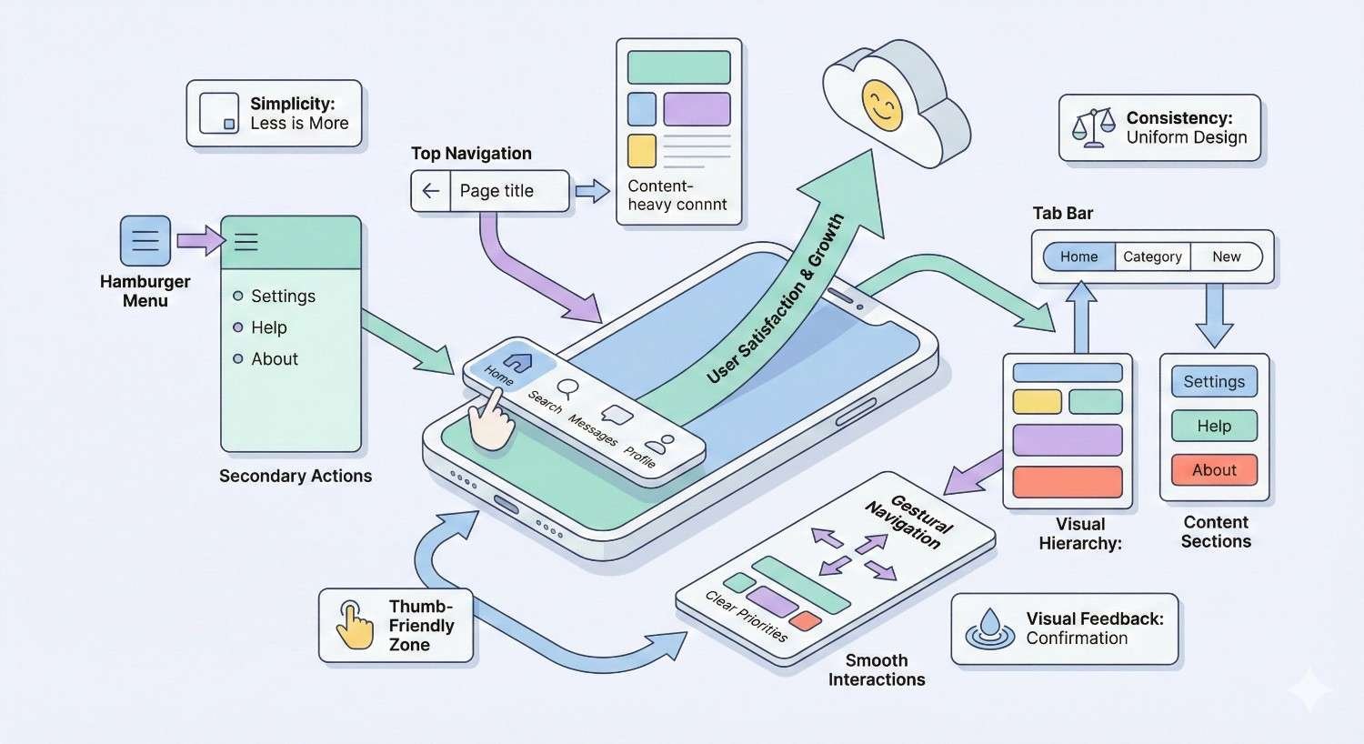
Mobile Navigation and User Experience Best Practices
Navigation design significantly impacts mobile usability. Patterns that work on desktop often fail on mobile due to screen size constraints and touch interaction requirements.
Mobile Menu Design Patterns
The hamburger menu (three horizontal lines) has become the standard mobile navigation pattern. Users recognize this icon and understand it reveals navigation options.
Position the menu toggle in a consistent, easily reachable location. Top-left or top-right corners are conventional placements. Ensure the toggle meets minimum touch target sizes.
Menu content should be scannable with clear hierarchy. Limit top-level items to essential destinations. Use expandable sections for secondary navigation rather than cramming everything into one level.
Consider bottom navigation for apps and app-like websites. Bottom placement keeps navigation within thumb reach, reducing the need to reposition hands.
Thumb-Friendly Navigation Zones
Research on mobile device handling reveals natural thumb reach zones. The bottom center of the screen is easiest to reach, while top corners require hand repositioning.
Place primary actions in easily reachable zones. Secondary actions can occupy harder-to-reach areas. This principle applies to navigation, buttons, and interactive elements throughout the interface.
For larger phones, consider that many users operate devices one-handed. Design for thumb reach rather than assuming two-handed operation.
Mobile Form Optimization
Forms present significant mobile usability challenges. Small screens, touch keyboards, and input complexity create friction that desktop forms don’t face.
Use appropriate input types to trigger correct keyboards:
html
Copy
<input type=”email“ name=”email“>
<input type=”tel“ name=”phone“>
<input type=”number“ name=”quantity“>
Minimize required fields. Each additional field increases abandonment probability. Request only essential information and make optional fields clearly marked.
Size input fields appropriately for touch interaction. Small input fields frustrate users and increase error rates. Provide adequate padding and clear focus states.
Enable autofill by using standard field names and autocomplete attributes:
html
Copy
<input type=”text“ name=”name“ autocomplete=”name“>
<input type=”email“ name=”email“ autocomplete=”email“>
Reducing Mobile Friction Points
Friction points are any elements that slow users down or create confusion. Identifying and eliminating friction improves conversion rates and user satisfaction.
Common mobile friction points include:
- Popups and interstitials that block content
- Captchas that are difficult to complete on mobile
- Complex multi-step processes
- Unclear error messages
- Missing progress indicators
- Unexpected page behavior
Test user flows on actual mobile devices to identify friction. Watch users attempt common tasks and note where they struggle or hesitate.
Testing and Monitoring Mobile Usability Over Time
Mobile usability requires ongoing attention. New content, design changes, and third-party updates can introduce issues. Systematic monitoring catches problems before they impact rankings significantly.
Setting Up Automated Mobile Monitoring
Configure automated alerts for mobile usability issues in Google Search Console. Email notifications inform you when new errors appear, enabling rapid response.
Integrate mobile testing into deployment pipelines. Automated tests can verify viewport configuration, touch target sizes, and responsive behavior before changes reach production.
Tools like Lighthouse CI run performance and accessibility audits automatically on each deployment. Failed audits can block deployments, preventing regressions from reaching users.
Mobile Usability KPIs to Track
Quantitative metrics reveal mobile usability trends over time. Track these indicators to measure improvement and identify emerging problems.
Mobile Bounce Rate and Engagement
Compare mobile bounce rate to desktop bounce rate. Significant gaps suggest mobile-specific problems. A mobile bounce rate substantially higher than desktop indicates usability issues driving users away.
Track mobile-specific engagement metrics:
- Pages per session (mobile vs. desktop)
- Average session duration (mobile vs. desktop)
- Scroll depth on key pages
- Click/tap patterns on navigation elements
Mobile Conversion Tracking
Segment conversion data by device type. Mobile conversion rates typically lag desktop, but extreme gaps indicate optimization opportunities.
Track micro-conversions on mobile:
- Newsletter signups
- Account creations
- Add-to-cart actions
- Form submissions
These intermediate actions reveal where mobile users drop off in conversion funnels.
Mobile Search Performance Metrics
Monitor mobile-specific search performance in Google Search Console:
- Mobile impressions and clicks
- Mobile click-through rate
- Mobile average position
- Mobile-specific query performance
Filter Search Console data by device to isolate mobile trends from overall performance.
Creating a Mobile Testing Schedule
Establish regular testing cadences to catch issues proactively:
Weekly:
- Review Search Console mobile usability report
- Check Core Web Vitals mobile scores
- Verify critical page functionality on test devices
Monthly:
- Full site mobile audit using multiple tools
- Competitive mobile experience comparison
- User feedback review for mobile-specific complaints
Quarterly:
- Comprehensive mobile UX review
- Device testing library updates
- Mobile strategy alignment with business goals
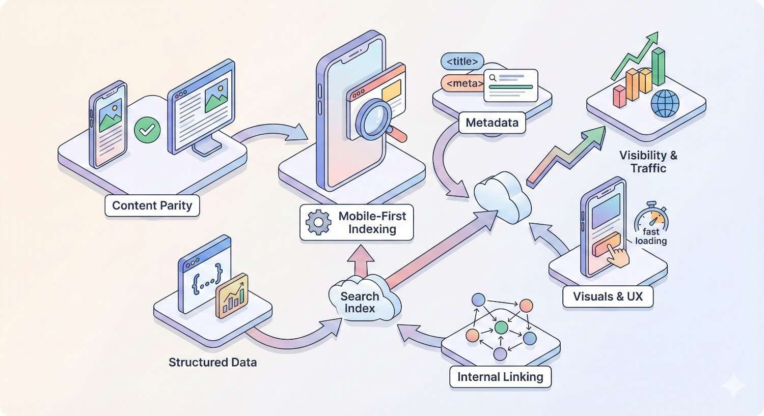
Mobile-First Indexing Considerations
Mobile-first indexing means Google predominantly uses mobile content for indexing and ranking. Understanding this system helps ensure your mobile site supports rather than undermines SEO efforts.
How Mobile-First Indexing Works
Googlebot primarily crawls and indexes the mobile version of your site. Desktop content is secondary. If your mobile site lacks content present on desktop, that content may not be indexed.
Google switched all sites to mobile-first indexing by default. New sites are automatically crawled mobile-first. There’s no opt-out mechanism.
The mobile version determines:
- What content gets indexed
- How pages rank in search results
- Which structured data Google processes
- What internal links Google follows
Content Parity Between Desktop and Mobile
Ensure mobile pages contain the same valuable content as desktop versions. Hidden content, collapsed sections, and tabs are acceptable if the content is accessible and crawlable.
Common parity issues include:
- Text content hidden on mobile for space reasons
- Images present on desktop but removed on mobile
- Internal links missing from mobile navigation
- Structured data only on desktop pages
Audit content parity by comparing desktop and mobile versions of key pages. Verify that all important content, links, and metadata appear on mobile.
Structured Data on Mobile
Structured data must be present on mobile pages for Google to process it. If you implement schema markup only on desktop templates, Google won’t see it during mobile-first crawling.
Verify structured data implementation using Google’s Rich Results Test with mobile user agent selected. Ensure all schema types appear correctly on mobile versions.
Common structured data types to verify on mobile:
- Organization schema
- Product schema
- Article schema
- FAQ schema
- Local business schema
- Breadcrumb schema
Advanced Mobile Optimization Strategies
Beyond basic usability fixes, advanced strategies can differentiate your mobile experience and provide competitive advantages.
Progressive Web Apps (PWA) for Enhanced Mobile Experience
Progressive Web Apps combine web and app capabilities. PWAs offer offline functionality, push notifications, and home screen installation while remaining accessible through browsers.
PWA benefits include:
- Faster subsequent loads through service worker caching
- Offline access to previously viewed content
- App-like experience without app store distribution
- Reduced friction compared to native app installation
Implementing PWA requires:
- HTTPS (mandatory)
- Web app manifest file
- Service worker for caching and offline support
- Responsive design
PWAs work well for content sites, e-commerce, and any application where repeat visits are common.
Accelerated Mobile Pages (AMP) Implementation
AMP provides a framework for creating fast-loading mobile pages through restricted HTML, streamlined CSS, and controlled JavaScript. AMP pages load nearly instantly from Google’s cache.
AMP adoption has declined as Core Web Vitals became the primary speed signal. Google no longer requires AMP for Top Stories carousel inclusion. However, AMP remains useful for specific use cases:
- News publishers with high-volume content
- Sites struggling to achieve fast load times otherwise
- Situations where Google cache delivery provides significant benefits
Evaluate whether AMP’s restrictions justify its benefits for your specific situation. Many sites achieve comparable speed through standard optimization techniques.
Mobile-Specific Schema Markup
Certain schema types have particular relevance for mobile users:
SpeakableSpecification identifies content suitable for text-to-speech playback, relevant for voice assistant integration.
HowTo schema with step-by-step instructions displays well on mobile search results, providing immediate value to users.
FAQ schema generates expandable question-answer pairs in search results, giving mobile users quick answers without clicking through.
Local Business schema powers mobile-specific features like click-to-call buttons and directions integration.
App Indexing and Deep Linking
If you have a native mobile app, app indexing connects web content to app content. Users with your app installed can open content directly in the app from search results.
Implement app indexing through:
- Android App Links
- iOS Universal Links
- Firebase App Indexing
Deep linking enables specific content targeting within apps rather than just launching the app’s home screen. This creates seamless transitions between web and app experiences.
Mobile Usability for Different Industries
Different business types face unique mobile usability challenges. Industry-specific considerations help prioritize optimization efforts.
E-commerce Mobile Optimization
E-commerce sites must optimize the entire purchase funnel for mobile. Product discovery, comparison, cart management, and checkout all require mobile-specific attention.
Key e-commerce mobile priorities:
- Product image zoom and gallery functionality
- Size/variant selection with adequate touch targets
- Streamlined add-to-cart process
- Mobile payment options (Apple Pay, Google Pay)
- Guest checkout without account creation
- Order tracking and account access
Mobile commerce continues growing as a percentage of total e-commerce. Sites that fail mobile optimization lose sales to competitors with better mobile experiences.
Local Business Mobile Requirements
Local businesses serve users who are often searching on mobile devices while in proximity to physical locations. Mobile optimization directly impacts foot traffic and phone calls.
Local mobile priorities:
- Click-to-call functionality with prominent phone numbers
- Directions integration with mapping apps
- Hours and location information immediately visible
- Mobile-friendly contact forms
- Local schema markup for enhanced search features
Google My Business optimization complements website mobile optimization for local businesses. Ensure consistency between GMB information and website content.
B2B Website Mobile Considerations
B2B sites traditionally focused on desktop users, but mobile usage has increased significantly in B2B contexts. Decision-makers research solutions on mobile devices even if final purchases happen on desktop.
B2B mobile priorities:
- Readable long-form content on mobile
- Downloadable resources accessible on mobile
- Contact and demo request forms optimized for mobile
- Case studies and testimonials formatted for mobile reading
- Clear navigation to key conversion pages
B2B mobile users often conduct initial research on mobile before switching to desktop for deeper evaluation. Ensure mobile experience supports this research phase effectively.
Content-Heavy Sites Mobile Strategy
Publishers, blogs, and content-heavy sites face unique challenges displaying large amounts of text on small screens.
Content site mobile priorities:
- Readable typography with appropriate sizing
- Clear article navigation and related content
- Efficient ad placement that doesn’t disrupt reading
- Fast loading despite content volume
- Effective content discovery and search
Infinite scroll, pagination, and content chunking strategies help manage long-form content on mobile. Test reading experiences on actual devices to verify usability.
Common Mobile Usability Mistakes to Avoid
Certain mistakes repeatedly cause mobile usability problems. Awareness of these pitfalls helps prevent issues before they occur.
Intrusive Interstitials and Popups
Google penalizes pages with intrusive interstitials that block content on mobile. Popups covering the main content immediately after users arrive from search create poor experiences.
Acceptable interstitials include:
- Cookie consent notices (legally required)
- Age verification (legally required)
- Login dialogs for paywalled content
- Small banners that don’t block significant content
Problematic interstitials include:
- Full-screen popups on page load
- Interstitials requiring dismissal before content access
- Standalone interstitials users must dismiss
If you use popups, trigger them based on user behavior (scroll depth, time on page, exit intent) rather than immediately on arrival.
Aggressive Mobile Advertising
Ads that disrupt mobile experience damage both usability and SEO. The Coalition for Better Ads defines standards for acceptable mobile advertising.
Avoid these ad formats on mobile:
- Pop-up ads
- Auto-playing video ads with sound
- Prestitial ads with countdown
- Large sticky ads
- Flashing animated ads
- Full-screen scrollover ads
Ad density also matters. Pages where ads occupy more space than content create poor experiences. Balance monetization needs with user experience requirements.
Unoptimized Mobile Checkout Flows
Checkout abandonment rates are higher on mobile than desktop. Complex checkout processes that work on desktop often fail on mobile.
Common checkout problems:
- Too many form fields
- Small input targets
- Missing mobile payment options
- Unclear error messages
- No progress indication
- Forced account creation
Simplify mobile checkout to essential steps. Offer guest checkout, mobile payment methods, and clear progress indicators. Test checkout flows on actual mobile devices regularly.
Ignoring Mobile Accessibility
Accessibility requirements apply to mobile experiences. Users with disabilities use mobile devices and assistive technologies.
Mobile accessibility considerations:
- Touch target sizes for users with motor impairments
- Color contrast for users with vision impairments
- Screen reader compatibility for blind users
- Captions for video content
- Alternative text for images
Accessibility improvements often benefit all users, not just those with disabilities. Larger touch targets, better contrast, and clearer navigation improve experiences universally.
How We Help Businesses Fix Mobile Usability Issues
White Label SEO Service provides comprehensive mobile usability solutions for businesses seeking to improve search visibility and user experience.
Our Mobile SEO Audit Process
Our mobile audits examine every aspect of mobile usability affecting search performance. We use multiple diagnostic tools combined with manual testing on real devices.
The audit covers:
- Google Search Console error analysis
- Core Web Vitals assessment
- Responsive design evaluation
- Touch target and interaction testing
- Content parity verification
- Mobile page speed analysis
- Competitive mobile experience comparison
Audit deliverables include prioritized issue lists, specific fix recommendations, and implementation guidance tailored to your technical environment.
Technical Implementation and Support
Our technical team implements mobile usability fixes directly or provides detailed specifications for your developers. We handle:
- Viewport and responsive design implementation
- Touch target optimization
- Image and media optimization
- JavaScript performance improvements
- Core Web Vitals optimization
- Structured data implementation
We work within your existing technology stack and development workflows, providing solutions compatible with your CMS, frameworks, and hosting environment.
Ongoing Mobile Performance Monitoring
Mobile usability requires continuous attention. Our monitoring services track mobile performance metrics and alert you to emerging issues.
Monitoring includes:
- Weekly Search Console mobile usability checks
- Core Web Vitals tracking and trending
- Mobile search performance analysis
- Competitive mobile experience benchmarking
- Quarterly comprehensive mobile audits
Regular reporting keeps stakeholders informed of mobile performance trends and optimization opportunities.
Expected Timeline and ROI from Mobile Optimization
Mobile usability improvements typically show results within weeks of implementation. Google recrawls pages and updates mobile usability status as fixes deploy.
Timeline expectations:
- Weeks 1-2: Implement critical fixes, submit for recrawling
- Weeks 3-4: Search Console errors begin clearing
- Months 2-3: Ranking improvements become visible
- Months 3-6: Full impact on traffic and conversions measurable
ROI from mobile optimization comes through:
- Increased mobile search visibility
- Reduced bounce rates
- Higher conversion rates
- Improved user satisfaction
- Better competitive positioning
The specific ROI depends on your current mobile usability status, traffic volume, and conversion values. Sites with severe mobile issues often see dramatic improvements. Sites with minor issues see incremental gains.
Conclusion
Mobile usability directly determines search visibility, user engagement, and conversion performance. Fixing viewport configuration, touch targets, font sizes, and page speed creates measurable improvements in rankings and business outcomes.
White Label SEO Service combines technical expertise with systematic processes to resolve mobile usability issues efficiently. Our audits identify problems, our implementations fix them, and our monitoring prevents recurrence.
We help businesses transform mobile experiences from ranking liabilities into competitive advantages. Contact White Label SEO Service to discuss your mobile optimization needs and timeline.
Frequently Asked Questions
How long does it take to fix mobile usability issues in Google Search Console?
After implementing fixes, Google typically recrawls affected pages within days to weeks. Search Console updates mobile usability status after successful recrawling. You can request indexing for specific URLs to accelerate the process.
What is the minimum font size for mobile SEO?
Google recommends body text of at least 16 pixels for mobile readability. Text smaller than this threshold may trigger mobile usability errors. Use relative units like rem for better scalability across devices.
Do mobile usability issues affect desktop rankings?
With mobile-first indexing, Google uses mobile content for all rankings, including desktop search results. Mobile usability problems can therefore impact your visibility across all devices, not just mobile searches.
How do I check if my site is mobile-friendly?
Use Google’s Mobile-Friendly Test tool, check the Mobile Usability report in Search Console, or run PageSpeed Insights with mobile selected. These tools identify specific issues and provide fix recommendations.
What are the most common mobile usability errors?
The five most common errors are: text too small to read, clickable elements too close together, content wider than screen, viewport not configured, and incompatible plugins. Most sites experience at least one of these issues.
Does page speed affect mobile usability scores?
Page speed is measured separately through Core Web Vitals but significantly impacts mobile user experience. Slow pages increase bounce rates and reduce engagement, indirectly affecting SEO performance even if they pass mobile usability tests.
Should I create a separate mobile site or use responsive design?
Responsive design is the recommended approach. Google prefers responsive sites over separate mobile URLs because they’re easier to crawl, index, and maintain. Separate mobile sites create duplicate content risks and require additional technical management.


