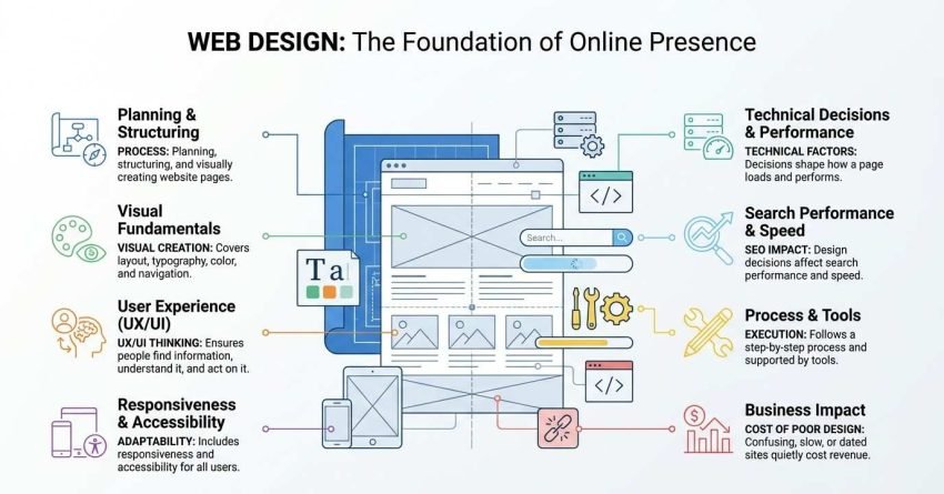
Web design is the process of planning, structuring, and visually creating the pages of a website so people can find information, understand it, and act on it. It covers layout, typography, color, navigation, responsiveness, accessibility, and the technical decisions that shape how a page loads and performs.
Most people meet a business through its website before they ever speak to anyone. A confusing, slow, or dated site quietly costs revenue every single day it stays live.
I wrote this guide as the starting point for everything web design touches. We cover what the discipline actually is and how it differs from development, the visual and structural fundamentals behind every page, the UX and UI thinking underneath them, how design decisions affect search performance and speed, the step-by-step process and the tools that support it, and the practical questions around platforms, costs, hiring, and life after launch.
What Web Design Actually Means
Web design is the discipline of deciding how a website looks, reads, and behaves before and during the build. I think of it as three overlapping jobs: structuring information, shaping the visual system, and defining how people move through it.
The word gets used loosely. Some people mean visuals only. Others mean the whole website production process, code included.
That looseness causes real problems when you hire. You ask for a designer, get beautiful mockups, and discover nobody is going to build them.
Web Design vs. Web Development
Web design decides what a page should look like and how it should behave. Web development writes the code that makes it real in a browser.
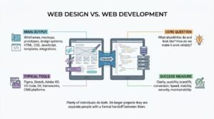
This table shows how the two roles split in practice:
| Dimension | Web Design | Web Development |
| Main output | Wireframes, mockups, prototypes, design systems | HTML, CSS, JavaScript, templates, integrations |
| Core question | What should this do and look like? | How do we make it work reliably? |
| Typical tools | Figma, Sketch, Adobe XD | VS Code, Git, frameworks, CMS platforms |
| Success measure | Clarity, usability, brand fit, conversion | Speed, stability, security, maintainability |
Plenty of individuals do both. On larger projects they are separate people with a formal handoff between them.
Web Design vs. Graphic Design
Graphic design is a broader visual discipline covering print, packaging, identity, and screen work. Web design is the branch focused specifically on interactive pages that respond to input, load at different speeds, and adapt to different screen sizes.
The difference matters more than it sounds. A poster never has to work on a 375px phone with a slow connection and a screen reader.
Why Web Design Matters for Business Outcomes
Web design directly affects whether visitors trust a business, understand its offer, and take action. It is the interface between marketing spend and revenue.
I have watched identical traffic convert at wildly different rates on two versions of the same offer. The variable was design, not demand.
First Impressions and Credibility
People judge a website almost instantly. A Google-backed study on visual complexity found users form aesthetic judgments of a page in as little as 50 milliseconds, before they read a word.
That first impression sets the tone for everything after it. Credibility gets decided before your copy gets a chance.
Conversion and Revenue Impact
Design changes move measurable numbers. Research summarized by Forrester has long put the potential return on well-executed UX investment at up to $100 for every $1 spent, driven by reduced friction and higher completion rates.
The mechanism is unglamorous. Clearer navigation, faster pages, fewer form fields, better contrast.
The Core Elements of Web Design
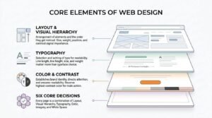
The core elements of web design are layout, visual hierarchy, typography, color, imagery, and white space. Every page you have ever used is some combination of those six decisions.
Beginners tend to obsess over color and imagery. Experienced designers spend most of their time on layout and hierarchy, because those two carry the meaning.
Layout and Visual Hierarchy
Layout is the arrangement of elements on a page, and visual hierarchy is the order in which those elements get noticed. Size, weight, position, and contrast all signal importance.
Get hierarchy right, and a page explains itself in two seconds. Get it wrong and everything competes.
Typography
Typography is the selection and setting of type so text is readable and the reading order is obvious. Line length, line height, size, and weight matter more than typeface choice.
I keep body copy between 16px and 20px and line length around 60 to 75 characters. That single habit fixes most readability complaints.
Color and Contrast
Color establishes brand identity and directs attention, while contrast determines whether text can actually be read. A palette that looks refined in a mockup often fails on a real screen in daylight.
Reserve your highest-contrast color for the one action you want most. If everything is bold, nothing is.
Imagery and White Space
Imagery carries meaning that copy cannot, and white space gives every other element room to register. White space is not emptiness; it is the thing that makes hierarchy legible.
Stock photography of handshakes helps nobody. Real product shots, real people, real interfaces earn their pixels.
User Experience (UX) Design Fundamentals
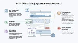
User experience design is the practice of structuring a website so people can complete their goals with minimum effort and confusion. UX design decides what goes where and why, before anyone picks a font.
The research part is what separates UX from decoration. You are testing assumptions about what people actually came to do.
Information Architecture
Information architecture is the organization and labeling of content so users can find what they need. It produces your sitemap, your navigation labels, and your URL structure.
Bad architecture is expensive to fix later because it is baked into every template and every link.
Navigation and Wayfinding
Navigation tells people where they can go, and wayfinding tells them where they currently are. Breadcrumbs, active states, and clear page titles do the second job.
Keep primary navigation to around five to seven items. Beyond that, recall collapses and people default to search.
User Interface (UI) Design Fundamentals
User interface design is the craft of the visual and interactive surface people touch: buttons, forms, menus, cards, and states. UI design turns the UX structure into something concrete and consistent.
UX decides that a filter belongs on the category page. UI decides what that filter looks like, how it behaves on tap, and what happens when nothing matches.
Design Systems and Components
A design system is a documented library of reusable components, tokens, and rules that keeps a site visually consistent as it grows. Buttons, form fields, spacing scales, and color tokens all live there.
Without one, page fifty looks nothing like page five. With one, new pages take hours instead of days.
Interaction States and Feedback
Every interactive element needs defined states: default, hover, focus, active, disabled, loading, and error. Missing states are the most common gap I see in beginner handoffs.
Focus states matter especially, because keyboard and screen reader users navigate entirely through them.
Responsive and Mobile-First Design
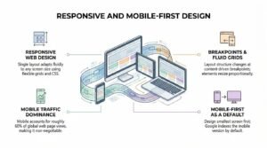
Responsive web design is an approach where a single layout adapts fluidly to any screen size using flexible grids, flexible images, and CSS media queries. One codebase serves phones, tablets, laptops, and large displays.
Mobile traffic makes this non-negotiable. StatCounter data puts mobile at roughly 60% of global web page views.
Breakpoints and Fluid Grids
Breakpoints are the screen widths where a layout changes structure, and fluid grids let elements resize proportionally between them. Choose breakpoints based on where your content breaks, not on specific device models.
Device-specific breakpoints age badly. Content-driven ones hold up.
Mobile-First as a Default
Mobile-first design means designing the smallest screen first, then adding complexity as space allows. Starting narrow forces brutal prioritization of what actually matters.
Google also indexes the mobile version of pages by default, so the small screen is the one search engines evaluate.
Web Accessibility and Inclusive Design
Web accessibility is the practice of building sites that people with disabilities can perceive, operate, and understand. Inclusive design widens that further to cover situational and temporary limitations, like bright sunlight or a broken wrist.
The WHO estimates that 1.3 billion people, about 16% of the world, live with significant disability. That is not an edge case.
WCAG Conformance Levels
The Web Content Accessibility Guidelines define three conformance levels, summarized here:
| Level | Meaning | Typical target |
| A | Minimum baseline; removes the worst barriers | Absolute floor |
| AA | Addresses the most common barriers | Standard commercial and legal target |
| AAA | Highest level; not achievable for all content | Selected content only |
Most organizations aim for WCAG 2.2 Level AA. US public-facing sites increasingly treat it as the compliance benchmark.
Common Accessibility Failures
The frequent failures are low color contrast, missing image alt text, unlabeled form fields, missing focus indicators, and content that only works with a mouse. Each has a straightforward fix at the design stage and an expensive one after launch.
Automated checkers catch maybe a third of issues. Keyboard testing catches most of the rest.
How Web Design Affects SEO Performance
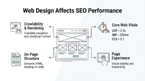
Web design affects SEO because design decisions determine whether search engines can crawl a page, render it, understand its structure, and measure a good page experience. Layout, code output, speed, and internal linking all originate in design.
This is where design stops being a taste conversation. Every visual choice has a crawl and ranking consequence.
Crawlability and Rendering
Crawlability is whether search engines can reach and read your pages, and rendering is whether they can see content that loads via JavaScript. Designs that hide critical content behind interactions or infinite scroll routinely lose it in the index.
Navigation built as real anchor links gets crawled. Navigation built as JavaScript event handlers often does not.
Core Web Vitals and Page Experience
Core Web Vitals are Google’s measurable page experience metrics covering loading, interactivity, and visual stability. Current thresholds are Largest Contentful Paint under 2.5 seconds, Interaction to Next Paint under 200 milliseconds, and Cumulative Layout Shift under 0.1.
Layout shift is almost purely a design problem. Reserve space for images, ads, and embeds and it disappears.
On-Page Structure and Semantic HTML
Semantic HTML uses elements that describe meaning, such as headings, lists, navigation, and articles, rather than generic containers. Correct heading structure gives search engines the outline of your page.
One H1 per page. Headings in order. No skipping levels for visual effect.
Website Speed and Performance Optimization
Website performance is how quickly a page becomes visible, interactive, and stable for a real user on a real connection. Speed is a design constraint, not a developer cleanup task.
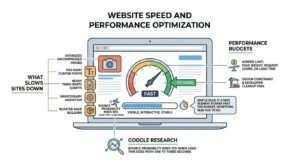
Google research found bounce probability rises 32% when load time goes from one to three seconds.
What Slows Sites Down
The usual culprits are oversized uncompressed images, too many custom fonts, heavy third-party scripts, unnecessary animation, and bloated page builders. Images alone typically account for the largest share of page weight.
Every hero video and tracking pixel has a cost. Somebody has to decide it is worth paying.
Performance Budgets
A performance budget is an agreed limit on page weight, request count, or load time that the team designs and builds within. Setting one before design starts prevents the slow creep of “just one more” script.
I like a simple rule: if a new element pushes past the budget, something else has to go.
Content Design and Copy Hierarchy
Content design is the practice of shaping words, structure, and order so a page communicates before it decorates. On the web, copy and layout are one decision, not two.
Designing around lorem ipsum guarantees rework. Real content changes real layouts.
Message Hierarchy Above the Fold
The area visible without scrolling should answer three questions: what this is, who it is for, and what to do next. Everything else can wait for a scroll.
A vague headline over a beautiful photograph is the most common expensive mistake on the web.
Scannability and Readability
Scannability means a visitor can extract the gist without reading every word, achieved through headings, short paragraphs, lists, and bold key phrases. Readability means the sentences themselves are easy to process.
Most people scan first and read second. Design for the scan, reward the read.
Conversion-Focused Design (CRO)
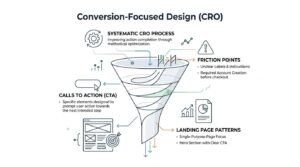
Conversion rate optimization is the systematic process of improving the percentage of visitors who complete a desired action. Conversion-focused design applies that thinking during design rather than after launch.
Beauty and conversion are not opposites. They just answer different questions.
Calls to Action and Friction Points
A call to action is the specific element prompting the next step, and friction is anything that makes taking that step harder. Friction usually hides in form length, unclear labels, unexpected costs, and required account creation.
Cut one form field and watch completion move. It works more often than it should.
Landing Page Design Patterns
A landing page is a single-purpose page built around one offer and one action, with distractions deliberately removed. Common patterns include the hero with a single CTA, social proof directly beneath, objection handling, and a repeated closing CTA.
Match the page to the ad that brought them. Mismatch kills conversion faster than bad design.
The Web Design Process, Step by Step
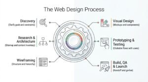
The web design process typically runs through six stages, listed here in order:
- Discovery: clarify goals, audience, competitors, and constraints
- Research and architecture: user research, sitemap, content inventory
- Wireframing: low-fidelity structure and hierarchy, no visual styling
- Visual design: typography, color, imagery, components, full mockups
- Prototyping and testing: clickable flows tested with real users
- Build, QA, and launch: development handoff, cross-device testing, go-live
Skipping stages does not save time. It relocates the work to the most expensive point in the project.
Discovery and Research
Discovery defines what the site must achieve and for whom, before any design work begins. It produces goals, success metrics, audience definitions, and technical constraints.
The best discovery question I know is simple: what has to be true in twelve months for this to have been worth it?
Wireframing and Prototyping
Wireframes are low-fidelity layouts showing structure and hierarchy without visual styling, and prototypes are clickable versions used to test flows. Both exist to find problems while changes are still cheap.
Grey boxes save arguments. Nobody debates brand color on a wireframe.
Visual Design and Handoff
Visual design applies typography, color, imagery, and component styling to the approved structure. Handoff packages those decisions with specs, assets, states, and documentation for developers.
Incomplete handoff is where good designs die. Every state, every breakpoint, every empty screen.
Build, QA, and Launch
Build converts designs into working templates, and QA verifies them across devices, browsers, and assistive technology before launch. A launch checklist covering redirects, analytics, forms, and indexing prevents the classic day-one disasters.
Test on real devices. Simulators lie about touch targets and font rendering.
Web Design Tools and Software
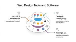
Web design tools fall into design and prototyping, handoff and collaboration, and testing. Here is what each category does:
| Category | Purpose | Common tools |
| Design and prototyping | Layouts, components, clickable flows | Figma, Sketch, Adobe XD, Penpot |
| Handoff and collaboration | Specs, assets, feedback, version history | Figma Dev Mode, Zeplin, Notion |
| Testing and QA | Usability, accessibility, performance | Maze, Lighthouse, axe DevTools, WAVE |
Tool choice matters far less than beginners expect. A clear thinker in a free tool beats a confused one in an expensive one.
Design and Prototyping Tools
Design and prototyping tools let you build layouts, reusable components, and interactive flows before code exists. Figma dominates because it is browser-based and built for multiplayer collaboration.
Learn one properly rather than three badly.
Handoff and Collaboration Tools
Handoff tools translate design files into the specifications, assets, and documentation developers need. Modern design tools increasingly include this natively rather than requiring a separate product.
The tool is not the handoff. The conversation is.
Platforms and Build Methods
The main build methods are hosted website builders, content management systems, and fully custom development. Each trades control against speed and cost.
This comparison shows where each one fits:
| Method | Best for | Control | Typical timeline |
| Website builder (Wix, Squarespace) | Small sites, tight budgets, no dev resource | Low | Days to weeks |
| CMS (WordPress, Webflow, Shopify) | Content-heavy sites, ecommerce, growing teams | Medium to high | Weeks |
| Custom build | Complex apps, unique requirements, scale | Full | Months |
Choose the least complex option that meets your requirements for the next two years.
Website Builders vs. CMS vs. Custom Build
Website builders provide templates and hosting in one closed system, a content management system separates content from presentation and allows deeper customization, and custom builds start from code with no platform constraints. Most small and mid-sized businesses land on a CMS.
Migrating later is possible but never as cheap as the sales page implies.
Choosing a Platform by Business Stage
Early-stage businesses usually need speed and low cost, growing businesses need content flexibility and integrations, and established businesses need scale, governance, and performance control. Match the platform to the stage you are entering, not the one you are leaving.
Overbuilding early is as costly as underbuilding late.
Web Design Costs and Timelines
Web design costs in the US typically range from a few hundred dollars for a template build to six figures for enterprise work. Scope, page count, custom functionality, and content production drive the number more than design hours do.
Typical Cost Ranges
These are realistic US ranges for a professionally designed site:
| Project type | Typical range | Typical timeline |
| Template-based small business site | $1,000 – $5,000 | 2 – 4 weeks |
| Custom-designed SMB site | $5,000 – $25,000 | 6 – 12 weeks |
| E-commerce site | $10,000 – $75,000+ | 8 – 20 weeks |
| Enterprise or complex platform | $75,000+ | 4 – 12 months |
Anyone quoting a fixed price before scoping is guessing. That guess ends up in your budget.
What Drives Timelines
Timelines stretch mainly because of content delays, expanding scope, slow feedback cycles, and unclear decision-making authority. Design and build time is rarely the bottleneck.
Name one decision-maker at kickoff. That single move saves weeks.
DIY vs. Hiring a Designer or Agency
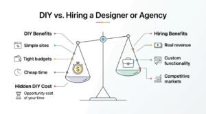
DIY works when the site is simple, the budget is tight, and your time is genuinely cheaper than the fee. Hiring makes sense when the site carries real revenue, needs custom functionality, or has to compete in a crowded market.
The hidden DIY cost is opportunity cost. Six weekends on a builder is six weekends not spent selling.
How to Evaluate a Web Designer
Judge a web designer on relevant portfolio work, a documented process, references from similar businesses, and their answers about measurement. Ask what happened to the sites after launch, not just how they looked at launch.
Watch for anyone who talks only about visuals. Ask them about accessibility, performance, and search and see what comes back.
Common Web Design Mistakes to Avoid
These are the mistakes I see most often, in rough order of damage caused:
- Designing for the business instead of the visitor
- Vague headlines that describe nothing specific
- Unoptimized images that destroy load times
- Poor color contrast that makes text unreadable
- Navigation with too many top-level items
- Hidden or unclear calls to action
- Ignoring mobile until the very end
- Designing with placeholder text instead of real content
- No plan for empty, error, or loading states
- Launching without analytics or tracking configured
Every one of these is cheap to prevent and expensive to retrofit.
Web Design Trends and What Actually Lasts
Web design trends are stylistic patterns that gain popularity for a period, while design fundamentals persist regardless of fashion. Clarity, hierarchy, speed, accessibility, and consistency have outlasted every trend cycle so far.
Current visible trends include bold typography, dark mode support, subtle motion, and AI-assisted personalization. Adopt the ones that serve your users and ignore the rest.
A dated-looking site that converts beats a fashionable one that confuses. Every time.
How to Maintain and Improve a Website After Launch
Website maintenance is the ongoing work of keeping a site secure, fast, accurate, and effective after launch. Launch day is the start of the useful life of a site, not the end of the project.
An ongoing cadence usually covers these five items:
- Security and updates: platform, plugin, and dependency patching
- Performance monitoring: Core Web Vitals and load time tracking
- Content freshness: updating dated pages, pricing, and claims
- Analytics review: behavior, conversion paths, and drop-off points
- Iterative improvement: testing changes against measured baselines
Set a monthly review. Sites decay quietly, and nobody notices until traffic does.
Conclusion
You now understand what web design covers: structure, visual craft, UX and UI thinking, responsiveness, accessibility, performance, and the process connecting them all.
These fundamentals sit at the center of a wider discipline spanning search performance, conversion optimization, and long-term site growth worth exploring further.
If you want a site built to rank and convert, we can help. Talk to White Label SEO Service about your project.
Frequently Asked Questions
What is web design in simple terms?
Web design is planning how a website looks and works before it gets built. It covers layout, colors, text, navigation, and how pages behave on different devices.
Do I need to know how to code to design a website?
No, coding is not required to design a website. Understanding basic HTML and CSS helps you design realistically, but design tools and builders handle the technical side.
How long does it take to design a website?
A small template-based site takes two to four weeks. A custom small business site usually takes six to twelve weeks, depending on content readiness and feedback speed.
What is the difference between UX and UI design?
UX design structures how a site works and what goes where. UI design shapes the visual surface people interact with, including buttons, forms, and colors.
Does web design affect Google rankings?
Yes, web design affects rankings through crawlability, page speed, mobile usability, and Core Web Vitals. Design decisions directly influence how search engines evaluate a page.
How much should a small business spend on web design?
Most US small businesses spend between $1,000 and $25,000. Template builds sit at the low end, while custom-designed sites with unique functionality sit higher.
What makes a website design “good”?
A good website design helps visitors complete their goal quickly. It loads fast, reads clearly, works on every device, and remains usable for people with disabilities.