
Blue is the most popular color in the world, chosen by roughly 37 to 45% of people depending on the survey. Red follows for its boldness, green for its link to nature, purple for creativity, and yellow for warmth even though it divides opinion more than the others.
I cover why blue wins so consistently, how red and green carry opposite meanings depending on where you are, what the science says about why your brain reacts to color at all, how color blindness changes what people actually see, how social platforms are now speeding up color trends, whether the “red button converts better” idea holds up, what 2026’s trend data is pointing toward, and how to actually choose a color for a brand instead of guessing. I also cover the colors most lists skip entirely black, white, and neutrals along with the accessibility standards and common mistakes that rarely get mentioned anywhere else.
What makes a color popular?
A popular color isn’t always the color people say they love most. Sometimes it’s popular because a brand uses it relentlessly until it becomes familiar. Other times it’s popular because of what it signals trust, energy, luxury in a specific industry or culture.
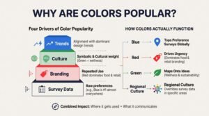
I think of color popularity as four separate things stacked on top of each other: raw preference data from surveys, repeated use in branding, cultural or symbolic weight, and alignment with whatever design trend is dominant at that moment. A color can score high on one of these and low on another.
Blue tops the preference surveys almost everywhere. Red dominates food and retail branding because it drives urgency, not because people rank it as their favorite. Green owns the wellness and sustainability space because it maps onto an idea, not just a shade. And in some regions, a color’s cultural meaning overrides whatever the global survey data says entirely.
That’s why I’m not just ranking favorite colors here. I’m also looking at where each color gets used, what it communicates, and why that combination matters more than preference alone.
The most popular colors in the world

No single factor decides which colors sit at the top. Some win because they perform well in product and interface design. Others earn their spot through sheer repetition across branding and culture.
Five shades consistently appear near the top across countries, age groups, and industries. Here’s how each one breaks down.
1. Blue: the undisputed global champion (37-45%)
Blue leads every major color preference survey by a wide margin. A 2024 Ipsos survey of over 18,000 respondents across 26 countries found that 37% picked blue as their favorite color overall, and the 2024 Harris Poll found 45% of U.S. men named it their top choice.
I think the reason blue wins so often comes down to association, not just aesthetics. It calls to mind open sky and clean water, two things humans have always needed to feel safe around. That association didn’t fade with modern life; it just shifted onto screens and logos.
Men favor blue more heavily than women do, and tech, finance, and healthcare brands lean on it constantly because it signals stability on sight. A new fintech app doesn’t need three paragraphs to feel trustworthy if its interface is already blue. The color is doing some of that work before a single word loads.
2. Red: the passionate runner-up (15-22%)
Red sits far behind blue in pure preference, typically landing between 15% and 22% depending on the survey, but it punches well above that number in branding influence. Fast food chains, clearance sales, and action-driven ads reach for red constantly because it physically grabs attention faster than cooler shades.
I’d describe red as the color that interrupts rather than the color that’s loved. It raises urgency, suggests limited time, and pushes a viewer toward a decision instead of letting them sit with it. That’s a completely different job than what blue does.
Meaning shifts hard by region here. In most Western markets red reads as danger, passion, or stop-and-pay-attention. In China it means the opposite: luck, celebration, and good fortune at events like weddings and New Year. A food brand expanding from the US into Chinese markets can keep the same red logo and have it land as a completely different emotional signal, which is exactly why global brands test color meaning market by market before launch.
3. Green: the rising eco-warrior (14-22%)
Green’s popularity has climbed steadily as sustainability and wellness have moved from niche interests to mainstream expectations. Preference numbers for green typically fall between 14% and 22%, with stronger results among younger demographics who grew up with climate and wellness messaging baked into daily culture.
I see green working on two levels at once. On a sensory level, it reads as natural, alive, and calming, the same reaction people get standing in a forest versus a parking lot. On a brand level, it’s become shorthand for “we care about the planet,” which is why eco-conscious companies reach for it almost automatically.
Wellness apps, organic food brands, and sustainability-focused startups use green to signal values before a customer reads a single product claim. That shortcut only works because the association is genuinely consistent across so many unrelated brands, which reinforces the meaning every time a new one adopts it.
4. Purple: the creative dark horse (14-20%)
Purple doesn’t come up first when people are asked to name a favorite color, yet it consistently lands in the 14% to 20% range once surveys actually ask. A 2021 Pew Research finding even showed 36% of American women preferring purple over blue’s 32% among that same group, which runs against the usual assumption that blue wins everywhere.
I think purple works because it’s rare in nature compared to blue or green, which gives it a built-in sense of distinction. It reads as creative, slightly unconventional, and a little more premium than the primary colors around it, without needing to be loud to get there.
Design studios, beauty brands, and tech startups targeting a younger audience use purple specifically because it signals originality. One packaging redesign using purple reportedly lifted a beauty brand’s sales by 18%, which suggests the color isn’t just liked, it’s doing real work on shelf differentiation.
5. Yellow: the divisive optimist (8-13%)
Yellow trails the other four, usually landing between 8% and 13% in preference surveys, and it’s also the most polarizing color on this list. Some people respond to it instantly and positively. Others find it harsh, especially in large doses or under bright lighting.
I’d put yellow’s real strength somewhere other than pure likability. It’s one of the fastest colors for the eye to register, which is exactly why it shows up on warning signs, hazard tape, and anything that needs to be seen before it’s read. That visibility advantage matters more in some contexts than being universally loved ever would.
Used carefully, yellow adds warmth and energy without overwhelming a layout, particularly as a small accent rather than a dominant tone. Brands targeting younger audiences have leaned into this in 2026, using yellow in short bursts to signal optimism rather than building entire palettes around it.
Black, White, and Neutral Tones: The Colors Competitors Leave Out
Most color popularity lists stop at blue, red, green, purple, and yellow, which leaves out two of the most functionally important colors in design: black and white. Neither shows up in casual “favorite color” surveys the way blue does, but both carry enormous weight in branding, fashion, and interface design.
Black communicates authority, luxury, and restraint. Premium brands from fashion to tech reach for black specifically because it reads as serious and expensive without saying either word. White does the opposite job: it signals cleanliness, simplicity, and space, which is why healthcare, minimalist tech, and wellness brands use it as a dominant background rather than an accent.
Neutrals as a broader category beige, cream, soft grays, warm taupes have grown sharply in both interior design and digital interfaces heading into 2026. Part of that growth ties directly to the same Pantone shift toward Cloud Dancer and other soft, off-white tones that I cover later in this piece. Neutrals rarely “win” a favorite-color survey, but they dominate actual visual environments because they let other elements, like a logo or a product photo, do the talking instead of competing with a loud background.
I’d argue the omission of black, white, and neutrals from most popularity rankings says more about how those surveys are worded than it does about real-world usage. Ask someone their favorite color and they’ll rarely say gray. Look at how many five-star hotel lobbies, tech product pages, and luxury packaging designs actually use gray, and the picture changes completely.
Why blue is the world’s favorite color
Blue’s dominance isn’t really about aesthetics. I think it comes down to three overlapping forces: a deep evolutionary association, a measurable physiological response, and decades of brand reinforcement.
The evolutionary piece goes back further than branding ever could. Clear water meant survival for early humans, and a clear blue sky meant stable weather and safety from storms. Neither of those associations required conscious thought; they got wired in simply because the people who responded calmly to blue environments tended to survive them better.
On the physiological side, some research suggests blue can correspond with a lower heart rate compared to warmer colors like red, which tend to correspond with a more activated response. That’s a meaningful difference if you’re designing something meant to feel calming, like a healthcare app, versus something meant to feel urgent, like a flash sale banner.
Then brand repetition locked the association in place. IBM, Facebook, and countless banks didn’t pick blue by accident; they picked it because the color was already doing reputational work before their marketing ever started. Every additional blue logo in finance or tech reinforces the same signal for the next one that adopts it.
Gender and Age Differences in Color Preference
Color preference isn’t uniform across demographics, and the gap is often wider than people expect. Men favor blue more heavily than women do in most major surveys, with some polls showing a split of roughly 57% versus 35% between the two groups. That’s not a small gap; it’s close to a 22-point swing on a single color.
Purple flips part of that pattern. The same 2021 Pew Research data I mentioned earlier found more American women preferring purple than blue, which doesn’t happen with most other shades. That suggests purple carries a different emotional register for women specifically, tied to creativity and individuality rather than the trust-and-stability signal blue sends more broadly.
Age plays its own role separate from gender. Younger audiences, particularly Gen Z and younger Millennials, show stronger affinity for green and purple tied to sustainability values and a desire to stand out from more traditional brand palettes. Older demographics tend to lean more conservative in color preference overall, gravitating toward blue, neutral tones, and classic combinations over bold or trend-driven shades.
I think this is one of the more underused pieces of color data in branding. A company targeting Gen Z women with a blue-dominant palette is working against two separate demographic patterns at once, not just picking a “safe” color.
Red, green, and purple mean different things around the world

A color that works perfectly in one country can send a completely different message in another, and that gap is wide enough to break a global campaign if nobody checks for it first. A one-size-fits-all color strategy fails more often than people expect, specifically because meaning isn’t universal even when the color is.
Here’s how the three most culturally variable colors shift by region:
| Color | Western Meaning | Eastern / Other Meaning |
| Red | Danger, passion, urgency, warning | China: luck, celebration, prosperity |
| Green | Nature, health, sustainability | China: a green hat can signal infidelity in a spouse |
| Purple | Creativity, luxury, individuality | Thailand: historically associated with mourning |
| White | Purity, simplicity, cleanliness | Parts of Asia: associated with mourning and funerals |
Red is the clearest example of this split. In most Western markets it means stop, danger, or urgency, which is why it dominates warning signs and clearance sales. In China, the same color means luck and celebration, which is why it’s everywhere during Lunar New Year and at weddings, worn by the bride rather than avoided.
Green carries its own regional trap. In most Western branding it signals health, nature, and sustainability without controversy. In China, a green hat specifically carries a negative meaning tied to infidelity, which is a narrow but real example of how one shade, in one specific application, can completely contradict its meaning everywhere else.
I think the practical takeaway is straightforward: blue is close to a universally safe choice precisely because its core associations (trust, calm, stability) translate across most cultures with minimal distortion. Red, green, and purple need a regional check before they go into a global campaign, because their meaning bends more depending on where the audience is standing.
Your brain really does react to favorite colors
Color preference isn’t just a matter of taste sitting somewhere abstract in a person’s mind. Researchers have actually measured how the brain responds to different colors using functional imaging, and the results back up what marketers have assumed for decades.
A team at the Max Planck Institute used fMRI scans and found that different colors trigger distinct activity patterns in the visual processing regions of the brain. That’s a baseline finding: color isn’t processed as one uniform input, it’s processed differently depending on which color is in front of you.
What’s more interesting is what happens with colors a person actually likes. Studies tracking brain response found that stronger personal preference for a color correlated with increased activity in regions tied to value judgment and attention, not just visual processing. In plain terms, a favorite color doesn’t just get seen; it gets flagged by the brain as worth paying attention to.
Cooler colors like blue tend to correspond with a calmer physiological state, while warmer colors like red and orange tend to correspond with a more activated one. I think that’s the clearest practical link between the psychology and the biology here: your favorite color isn’t random, but it’s also not purely conscious. Your brain is reacting to it before you’ve fully registered why.
Millions of people do not see your colors the same way
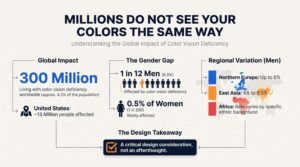
Most people assume everyone sees color identically, and that assumption is wrong for a meaningful share of the population. Roughly 300 million people worldwide live with some form of color vision deficiency, which works out to about 4.5% of the global population.
The distribution isn’t even across genders or regions. It affects close to 1 in 12 men but only around 0.5% of women, a gap tied to how the relevant genes are inherited. In the United States alone, estimates put the affected population at around 13 million people.
Regional variation adds another layer. Studies on Northern European populations have found rates as high as 8% in men, while East Asian populations often show rates closer to 4% to 6.5% for men. African populations show their own variation depending on specific ethnic background, which means there’s no single global number that applies evenly everywhere.
This isn’t a rare edge case limited to one country or one group. It’s a consistent, measurable percentage of any audience a brand or designer is building for, which makes it a design consideration rather than an afterthought.
What color blindness really looks like
Color blindness rarely means seeing the world in black and white, and that assumption causes more confusion than it clears up. Close to 99% of people with some form of color blindness can still perceive color; the difference is in range and distinction, not absence.
The most common form is red-green color blindness, where those two specific colors become difficult to tell apart under certain lighting or saturation levels. Blue-yellow color blindness exists too, but it’s far less common, and complete color blindness, where no color is perceived at all, is genuinely rare.
I think the clearest way to understand the practical impact is through a simple example. If an app uses a red button and a green button that look nearly identical to someone with red-green color blindness, that interface just became harder to use for a meaningful share of its audience, through no fault of the user. The same risk applies to charts, maps, signage, and packaging that lean on color alone to separate categories.
How color blindness changes what people see
Color often gets used as a shortcut for communicating something fast, and that shortcut breaks down for a measurable portion of any audience. Green commonly means “go,” red commonly means “stop,” and a bright button commonly means “click this one.” All three of those signals depend entirely on the viewer being able to distinguish the colors involved.
When that distinction fails, the message doesn’t just get weaker, it can disappear entirely for that viewer. A chart with a red line and a green line might read as two overlapping gray lines to someone with red-green color blindness, which defeats the entire purpose of using color to separate the data in the first place.
This reaches further than the base statistics suggest, too. Vision changes with age, bright sunlight can wash out screen contrast, and different monitor calibrations shift how colors actually render. The core lesson holds regardless of the exact numbers: color alone is never a reliable way to carry a message that matters.
Color Accessibility Standards Designers Should Actually Follow
Knowing that color blindness exists is one thing. Actually designing around it requires a concrete standard, and the one most widely used is the Web Content Accessibility Guidelines (WCAG) published by the W3C.
WCAG sets specific contrast ratio requirements between text and its background, measured as a numeric ratio rather than a subjective judgment call. Here’s how the core thresholds break down:
| Content Type | Minimum Ratio (AA) | Enhanced Ratio (AAA) |
| Normal body text | 4.5:1 | 7:1 |
| Large text (18pt+ or bold 14pt+) | 3:1 | 4.5:1 |
| UI components and graphical objects | 3:1 | Not defined |
I think the most practical habit a design team can build is never relying on color alone to carry meaning. Pairing a red error state with an icon and a text label, instead of just a red border, means the message still lands even if the specific red doesn’t register clearly for a given viewer. The same logic applies to charts: patterns, labels, or icons alongside color let the data stay readable regardless of how someone’s vision processes the palette.
Testing with a contrast checker before launch catches most of these issues early, and it’s a far cheaper fix during design than after a product ships and users start reporting that they can’t read something.
Social media algorithms are creating color trends
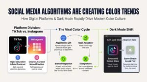
Color trends used to spread slowly, moving through fashion runways, print advertising, and word of mouth over months or years. Now a shade can go from obscure to everywhere within a single week, purely because a platform’s algorithm decided to push it in front of millions of people at once.
TikTok and Instagram push different kinds of color
TikTok rewards colors built to stop a scroll mid-motion. Bold, high-saturation shades perform better there because the platform itself is built around split-second attention decisions, and even TikTok’s own brand identity leans into sharp contrast between vivid pink and bright blue.
Instagram runs on a different logic entirely. It tends to favor cleaner, more curated visuals, which is why soft pastels, neutral tones, and muted palettes often perform better there than the loud saturation that wins on TikTok. Both platforms are built around photos and short video, yet they end up pushing noticeably different color moods because their underlying engagement mechanics reward different things.
The pattern behind a viral color trend is fairly consistent once you’ve seen it a few times: a post using a bold or unusual shade gets picked up by the algorithm, more users see it, some of them copy the look, the color starts appearing across unrelated content, and brands eventually notice and fold it into their own output. Brat Green from 2024 followed exactly this path, moving from a single album cover to a broader cultural moment largely through TikTok’s amplification.
Dark mode changes colors too
Dark mode adoption adds another layer that didn’t exist a decade ago. Industry estimates suggest roughly 82% of users enable dark mode when a platform offers it, which means a huge share of any digital audience is viewing color choices against a black or near-black background rather than white.
That shift matters more than it might seem. A bright, saturated color can genuinely glow against a dark background in a way it never does on white, while the same shade can look flat or washed out once the background flips back to light. Design teams working on digital products increasingly plan for both contexts from the start rather than treating dark mode as an afterthought retrofit, specifically because color behavior isn’t consistent between the two.
The red button myth: what actually drives conversions
A specific claim circulates constantly in marketing circles: red buttons convert better than other colors, full stop. It’s a simple idea, and simple ideas spread fast, but the data behind it doesn’t actually support treating it as a universal rule.
The claim traces back to a well-known HubSpot test where a red call-to-action button outperformed an otherwise identical green one by 21%. That result is real, but the conclusion people drew from it overreaches what the test actually showed.
I think the more likely explanation is contrast, not color preference. The green button in that test was close to the surrounding brand palette, which made it easy to overlook. Red stood out against that same background, which made it easier to notice, and noticing a button is the first step before anyone can click it. The color itself may have mattered far less than how much it stood out from everything around it.
Broader data backs up the contrast explanation over a color-specific one. High-contrast design elements have been shown to generate up to 23% more clicks than low-contrast versions, regardless of which specific colors are involved. In a separate analysis of 89 real store-level button tests, red only outperformed its alternative in 38% of cases, meaning it lost the majority of the time once it was tested across different sites and layouts.
Once stronger factors like copy, layout, and trust signals are already doing their job, the average lift attributable to color choice alone tends to land closer to 2.4%. Color consistency, meaning sticking with a color scheme the audience already recognizes from the rest of the site, has actually been shown to outperform a so-called “optimal” color choice by as much as 18%.
The practical lesson holds up better than the red-button myth ever did: contrast beats color, consistency beats guessing, and testing beats following a rule someone read in a blog post once. A genuinely data-driven approach to on-page optimization tests contrast and layout before locking in a specific color, because the color is rarely the variable doing the real work.
How Color Choices Affect Click-Through Rates and On-Page Engagement
Color choice reaches further than brand aesthetics once a page actually has to perform in search results and hold a visitor’s attention. The same contrast principle that drives button conversions applies directly to how a page’s title, meta description styling, and visible design elements get noticed in a crowded results page or a busy layout.
I’d separate this into two distinct effects worth understanding on their own. The first is attention: high-contrast color choices around calls-to-action, headers, and key page elements genuinely do make a page easier to scan, which correlates with lower bounce rates and longer time on page, both signals that factor into how a page performs over time. The second is trust: color consistency across a site, meaning the same palette carrying through from a search snippet’s implied branding to the actual landing page, reduces the sense of mismatch that makes visitors leave immediately after clicking through.
Neither of these effects works as a shortcut around solid content or technical fundamentals, and I want to be direct about that. Color supports a well-structured page; it doesn’t rescue a poorly optimized one. In practice, that means color decisions on a site belong inside the same strategic process as content structure, internal linking, and technical health, not bolted on separately after the fact by whoever happens to like a particular shade.
This is part of why a genuinely full-service approach to organic growth treats visual and UX elements as part of the broader technical and content picture rather than an isolated design task. When color, layout, and content strategy get planned together instead of in separate silos, the on-page experience holds together in a way that supports both user engagement and long-term search visibility.
2026 color trends: earth tones still lead

The overall color mood heading through 2026 feels calmer and more grounded than the high-saturation trends of a few years ago. Pantone’s Color of the Year, Cloud Dancer, is a soft off-white, and it’s representative of a much broader shift toward natural, believable tones rather than anything meant to shock or demand attention.
Here’s what’s actually showing up across trend reports this year:
- Cloud Dancer — a soft, light off-white that reads as calm and clean rather than stark or clinical
- Chocolate Brown — rich and earthy, warm without tipping into anything loud
- Sage Green — gentle and natural, strongly tied to the wellness positioning I covered earlier
- Burgundy — a deeper, more mature alternative to bright red that still carries warmth
- Natural Earth Tones broadly — shades pulled from soil, stone, and untreated wood rather than synthetic pigment references
I think this shift reflects something bigger than seasonal trend-chasing. Growing interest in sustainability has made colors that look and feel “natural” read as more honest to a lot of consumers, almost as a visual shorthand for the same values driving the sustainability conversation in branding more broadly. A palette built from Cloud Dancer, sage, and chocolate brown doesn’t just look current, it signals a specific set of values before a single word of copy gets read.
The throughline across 2026’s trend data is that color is doing less shouting and more grounding. That’s a meaningful shift from the neon-heavy, maximalist palettes that dominated a few years earlier, and it lines up with the broader mood around calm, trust, and authenticity that’s shaping design decisions well beyond just color.
How to Choose Colors for Your Brand Without Guessing
Most of what gets written about brand color stops at description: here’s what blue means, here’s what red means, pick whichever fits your vibe. That’s not actually a decision framework, and it leaves a lot of business owners choosing colors the same way they’d choose a wall paint, based on gut feeling alone.
I’d work through it in a specific order instead:
- Start with what the color needs to signal, not what you personally like. A healthcare brand needs trust and calm first; a flash-sale page needs urgency first. Personal preference matters less than functional fit.
- Check cultural meaning for every market you actually operate in. A color that reads as safe in the US can carry a completely different weight in another region, as the red and green examples earlier in this piece show clearly.
- Test contrast before testing color. The red button data makes this clear: a color that doesn’t stand out against its background won’t perform well regardless of which shade it is.
- Build in accessibility from the start, not as a retrofit. Running your palette against WCAG contrast ratios before launch costs almost nothing. Fixing it after users complain costs considerably more.
- Plan for both light and dark display contexts. With the majority of users enabling dark mode when it’s available, a color chosen only against a white background is only half-tested.
- Stay consistent once you’ve chosen. The data on color consistency outperforming a theoretically “optimal” color by 18% is a strong argument against constantly chasing the newest trend shade.
I think the mistake most brands make is treating color choice as a single creative decision made once, early, and never revisited with actual data. Treating it instead as a testable, criteria-based decision, the same way a team would approach any other performance-driving element on a page, tends to produce results that hold up longer than instinct alone.
Common Mistakes Brands Make When Picking Colors
A handful of color mistakes show up repeatedly across brands of every size, and most of them are avoidable once you know to look for them.
The first is picking a color based purely on personal taste rather than what the color needs to communicate to the actual target audience. A founder’s favorite shade and the color that builds trust with their specific customer base aren’t always the same thing, and assuming they are is one of the most common and costly color decisions a brand makes early on.
The second is ignoring cultural context when expanding into new markets. A palette that performs well domestically can carry an entirely different, sometimes negative, connotation elsewhere, and finding that out after launch is a far more expensive lesson than checking in advance.
The third is relying on color alone to communicate something important, whether that’s a warning, a call-to-action, or a data distinction on a chart. Given that a meaningful share of any audience has some form of color vision deficiency, color-only signaling quietly excludes real users every time it’s used.
The fourth is chasing every new trend color instead of building a consistent palette and sticking with it. The data throughout this piece points the same direction repeatedly: consistency tends to outperform novelty once you’re past the initial creative decision, and jumping palettes every year undermines the recognition a consistent color builds over time.
Conclusion
Blue remains the world’s clear favorite color, but favorite and most effective aren’t always the same thing. Red, green, and purple each do work that blue can’t, depending on the audience, the culture, and the specific message a brand needs to send.
Color preference isn’t just personal taste floating free of explanation either. The brain responds to color in measurable ways, cultural context reshapes meaning entirely depending on where you are, and a meaningful share of any audience physically sees color differently than the rest.
The real takeaway isn’t to chase whatever color is trending or popular this year. It’s to choose with context, test instead of assume, and make sure the choice actually works for the people seeing it. At White Label SEO Service, we help brands make sure every part of a page, color included, is working together toward real visibility and performance rather than guesswork.
Frequently Asked Questions
What is the most popular color in the world?
Blue is the most popular color in the world. Most surveys place it first, with roughly 37-45% of people choosing it as their favorite overall.
What are the top 5 most popular colors in the world?
The top five are blue, red, green, purple, and yellow. Exact rankings shift slightly depending on the survey, country, and age group studied.
Do color meanings change in different countries?
Yes, significantly. Red signals danger in many Western countries but means luck and celebration in China, showing how far meaning can shift by region.
Is a popular color always the best color for branding?
No. A color’s overall popularity doesn’t guarantee it fits a specific brand, audience, or industry. Context and function matter more than general preference.
How does color blindness affect design?
It makes certain color combinations, especially red and green, hard to distinguish. Good design pairs color with text, icons, or patterns instead of relying on color alone.
How many people are colorblind worldwide?
Around 300 million people worldwide have some form of color vision deficiency, roughly 4.5% of the global population, affecting men far more often than women.
Do social media platforms shape color trends?
Yes. Platforms like TikTok and Instagram can push a specific shade to millions of viewers within days, accelerating trend cycles far beyond what traditional media allowed.
What’s the actual contrast ratio needed for accessible text?
WCAG AA standards require at least a 4.5:1 contrast ratio for normal body text and 3:1 for large text, measured against the background color.
Does color consistency matter more than picking a trendy color?
Yes. Data shows color consistency can outperform a so-called “optimal” or trendy color choice by as much as 18%, since recognition builds through repetition.